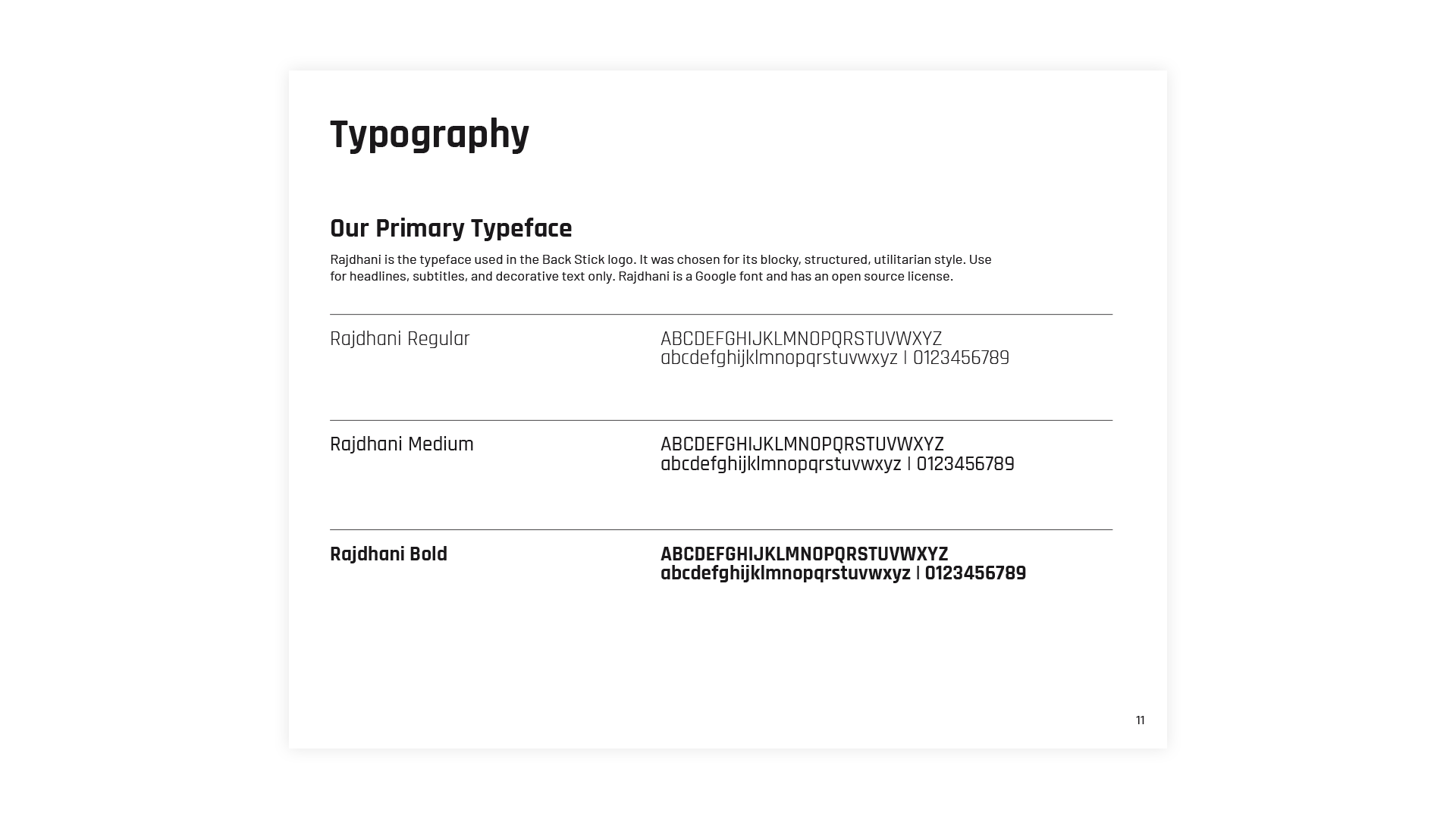
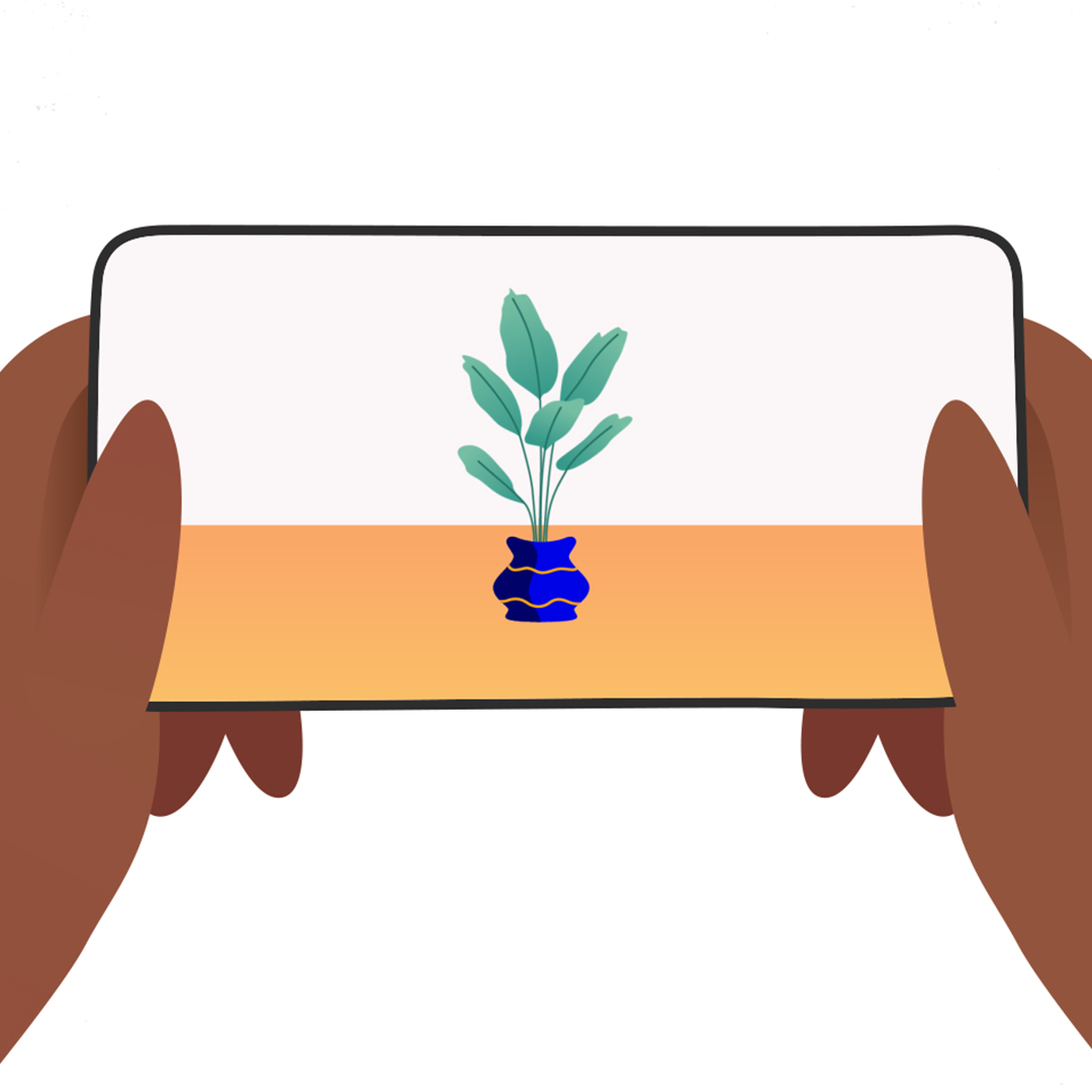
Shape
Introduction
Shape is a design collective offering a robust set of services guided by just the right attitude — innovative, resourceful and committed to our clients.
Work
The Screening Room Website
- Branding
- Website

The Screening Room is a 3-screen independent movie theatre located in the heart of downtown Kingston, Ontario.
When it came to redesigning the website there was a significant effort to improve both the user experience and the content management workflow. Both of these efforts were achieved through the design and development of custom WordPress page templates.
A new logo and visual identity was designed to capture the ornamental style of Art Nouveau.

The website’s redesign homepage template places focus on featured movies both playing now and coming soon.

The Showtimes template compiles individual movie post showtime information automatically into an organized list of what’s playing over the next two week period.

The individual movie template highlights the movie poster and details about the movie including a pop-up to watch the trailer without having to leave the page.

Project Credits
Logo and website design/development by Shape
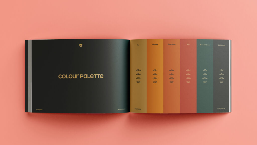
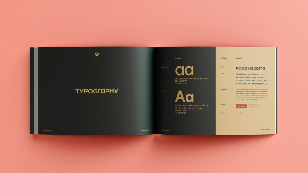
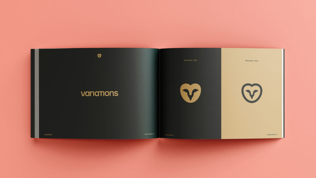
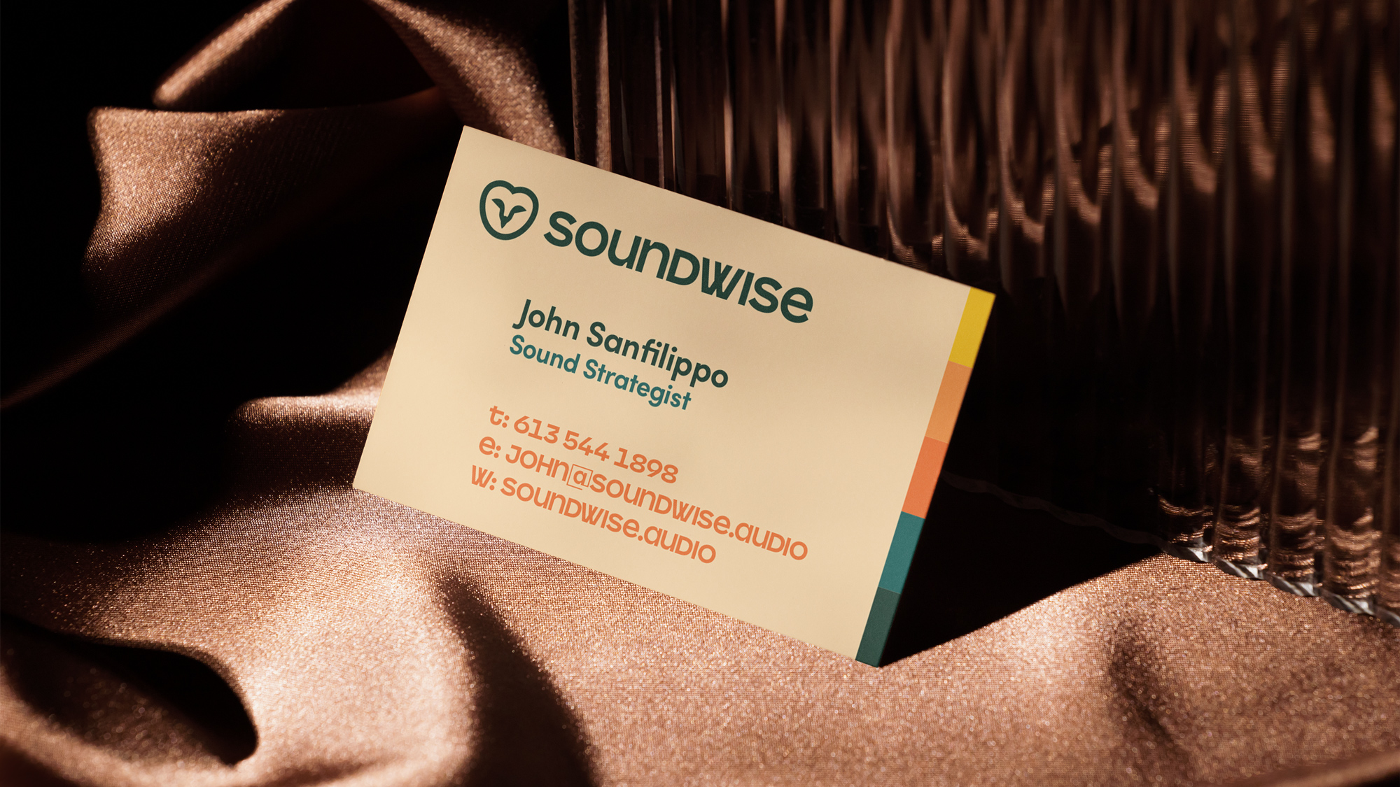
SoundWise Rebrand
- Branding
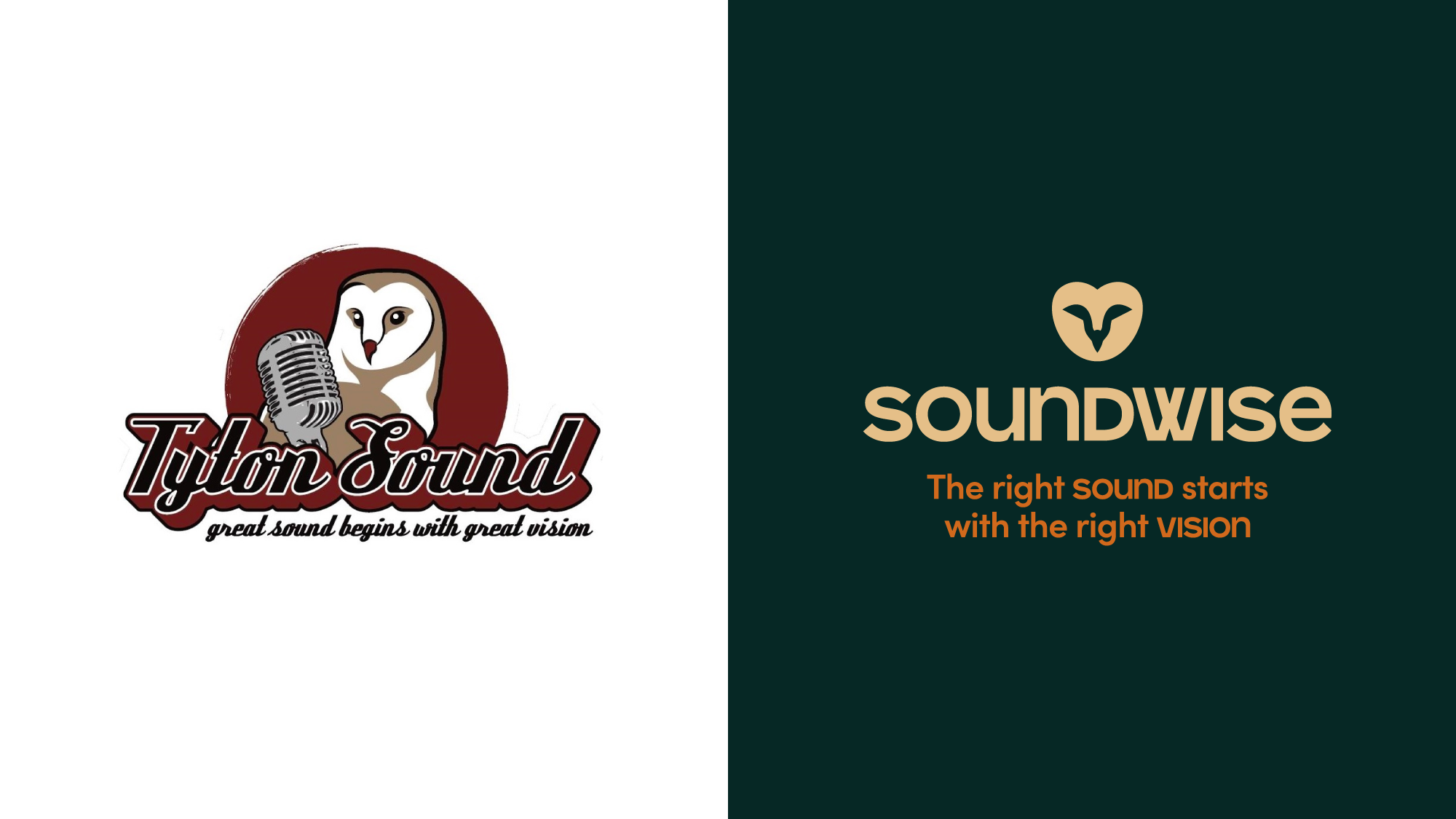
Formerly known as Tyton Sound, this Kingston-based audio branding company sought a new visual identity to exemplify its new name—SoundWise.
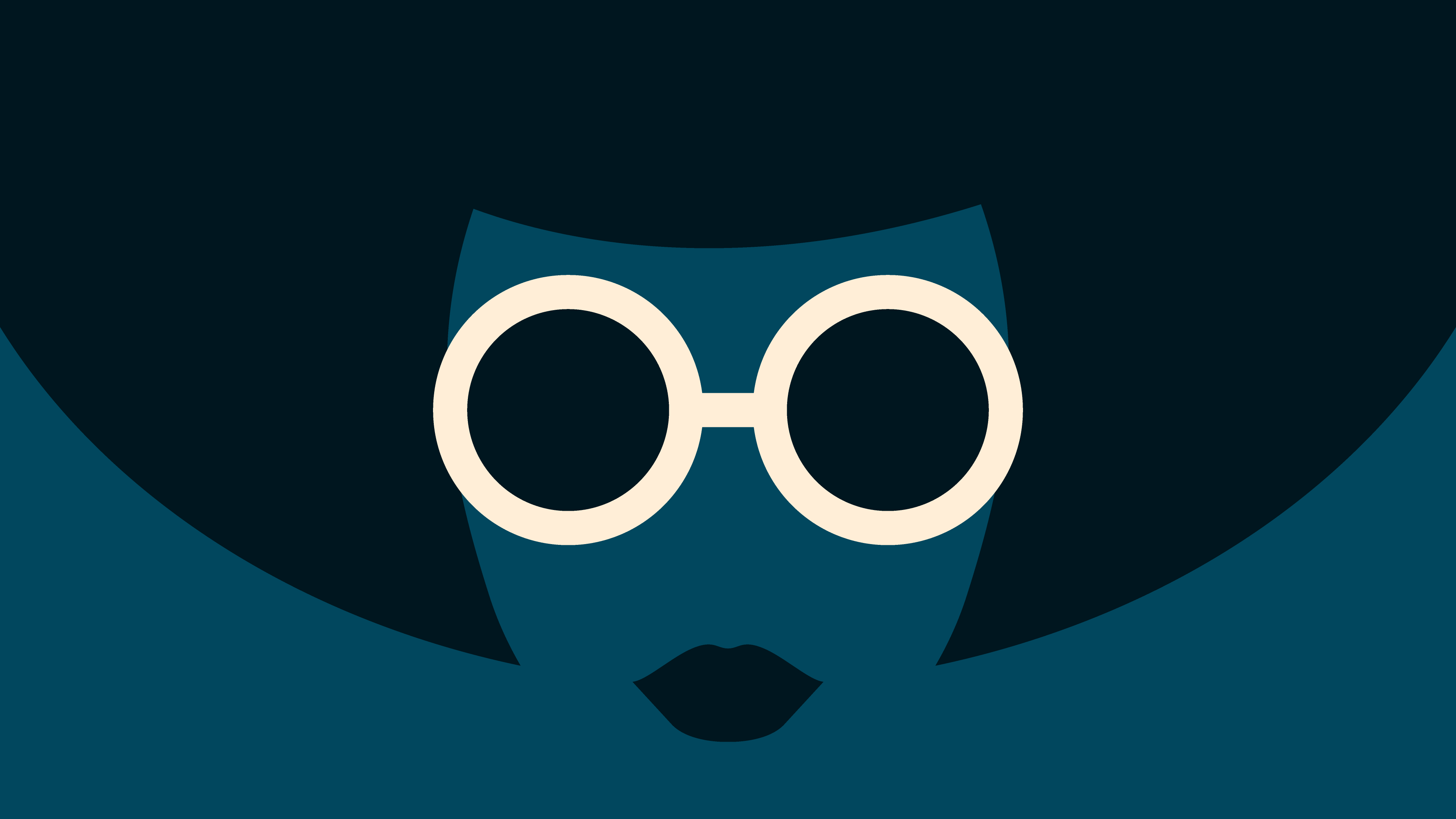
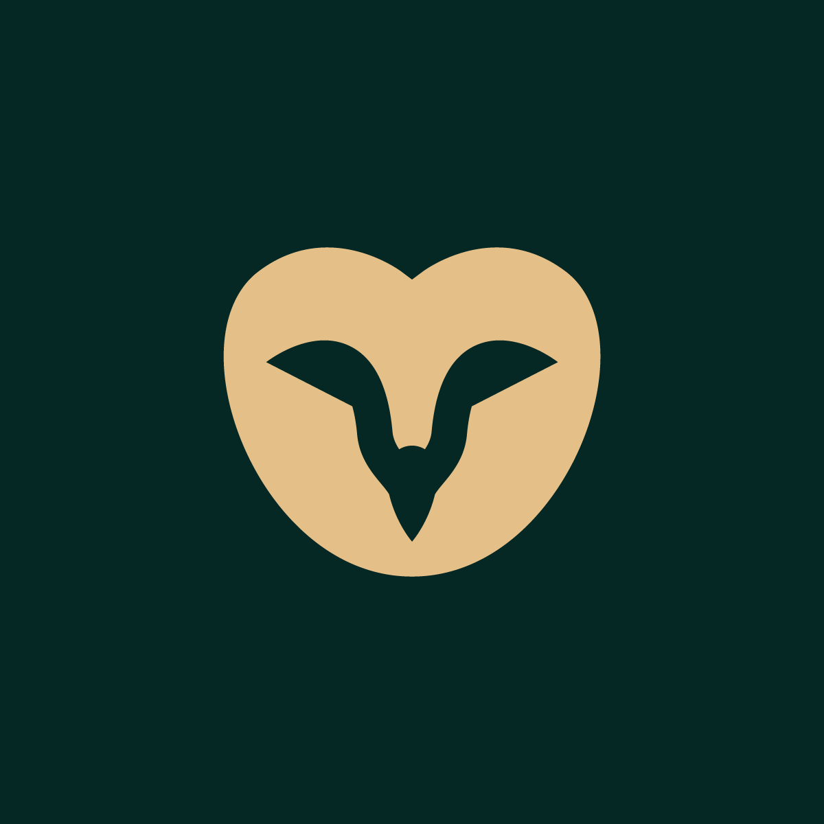
They wanted a professional identity that still had personality. The previous mark was of a barn owl in an illustrated style, and there was hope that the owl could continue to be used as it worked well with the new name. The simplified barn owl brandmark is an excellent nod to the past while bringing a fresh and more professional look to the brand.
The font used for the wordmark was chosen for its fun aesthetic via its use of unicase letters. The mix of lowercase and uppercase letters makes it quirky while still looking clean and professional.
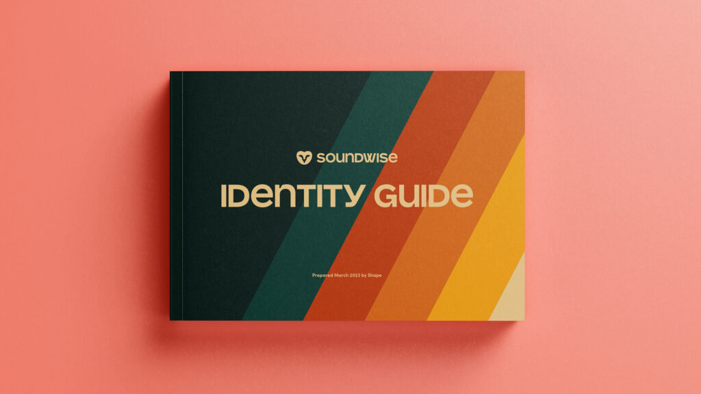
An identity guide was also designed to outline colours, fonts, and logo variations to keep the brand presentation consistent.
OACC Educational Videos
- Animation
- Illustration
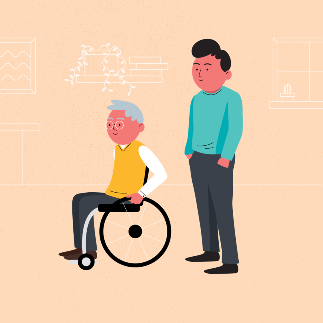
The Older Adult Council of Calgary needed to raise awareness about the struggles of financial insecurity in old age.
They wanted to showcase three case studies, featuring unique characters and their stories. Each script told the story of a different financial struggle that an older person may face in retirement. The purpose of these videos was to raise awareness of the financial difficulties that many people may face as they age.
Subtle background designs were used to add context while keeping the main focus on the characters.
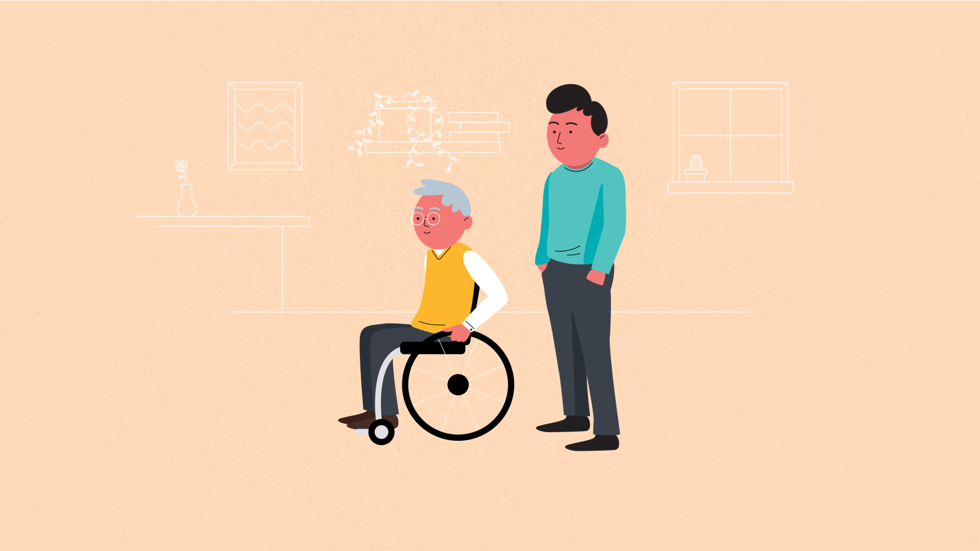
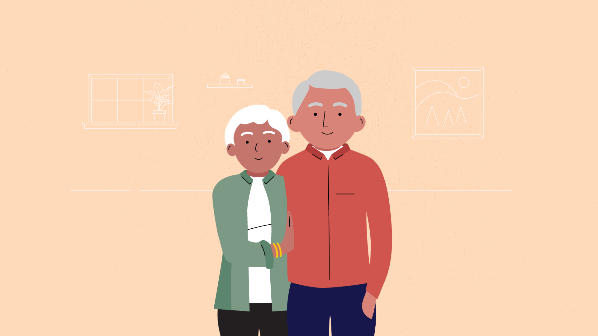
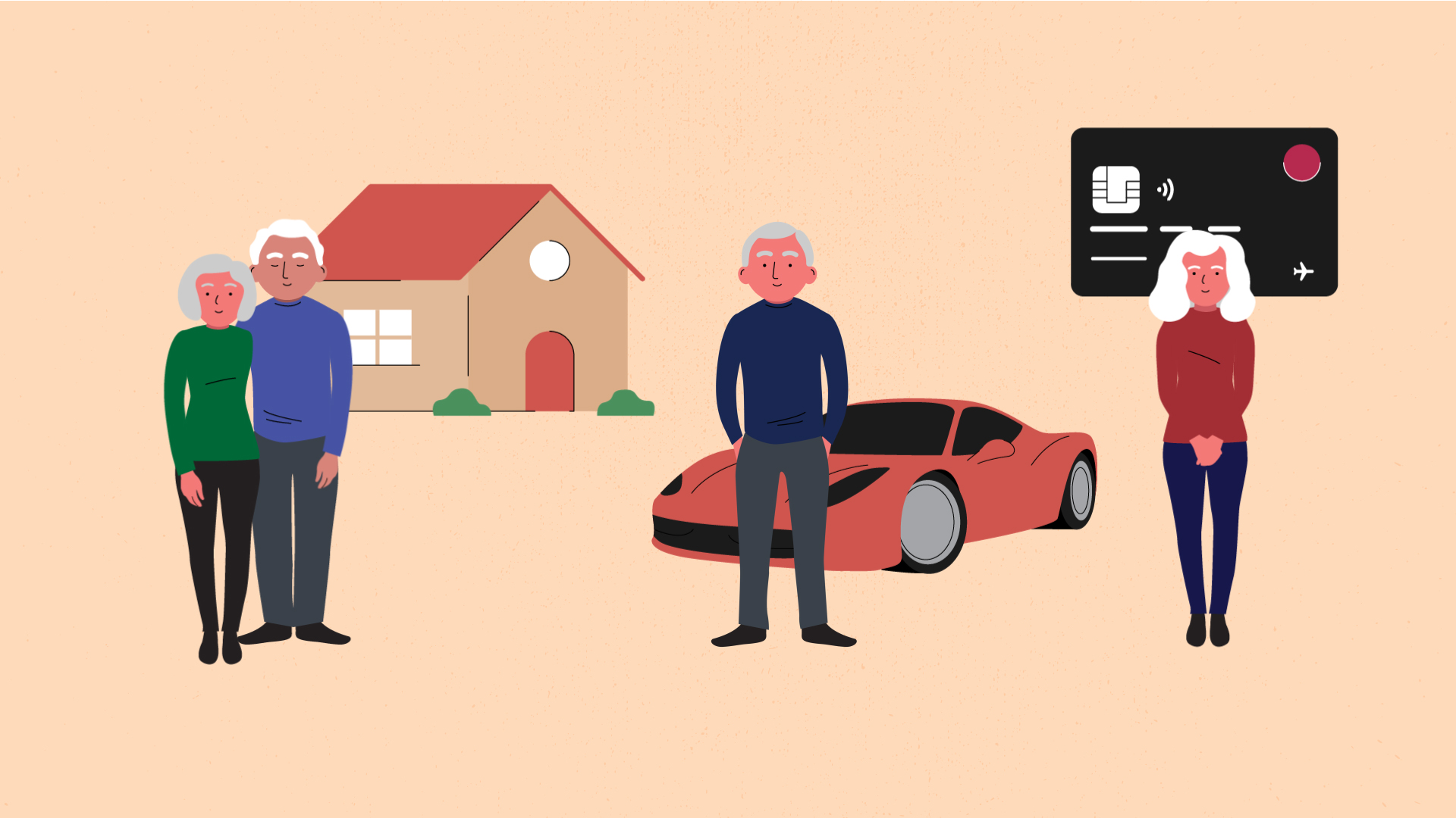
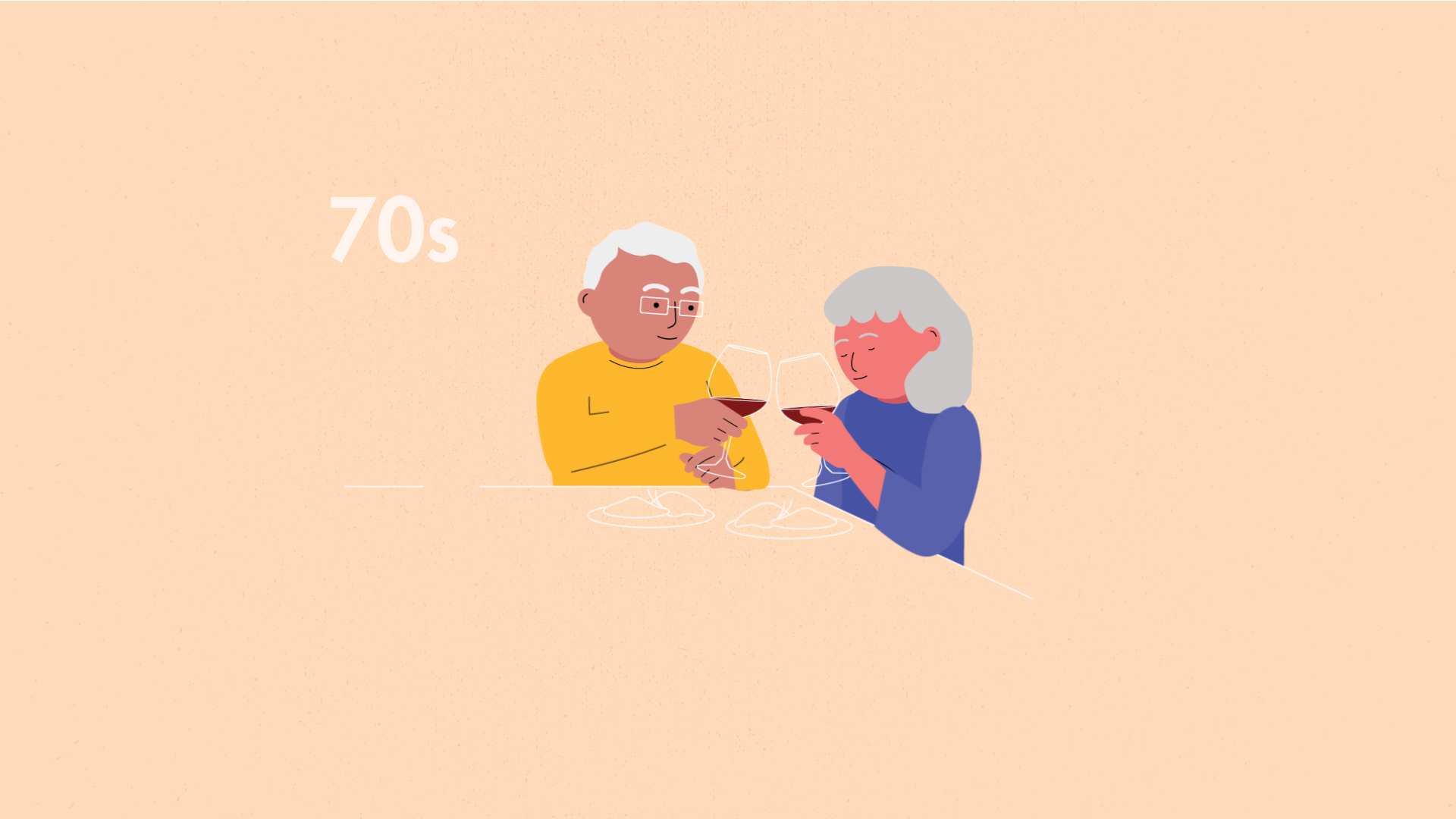
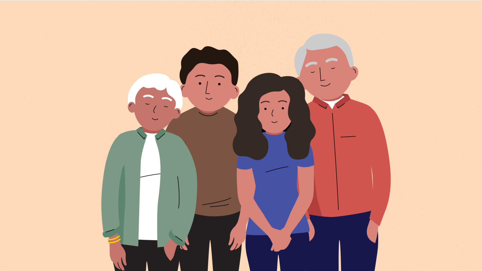
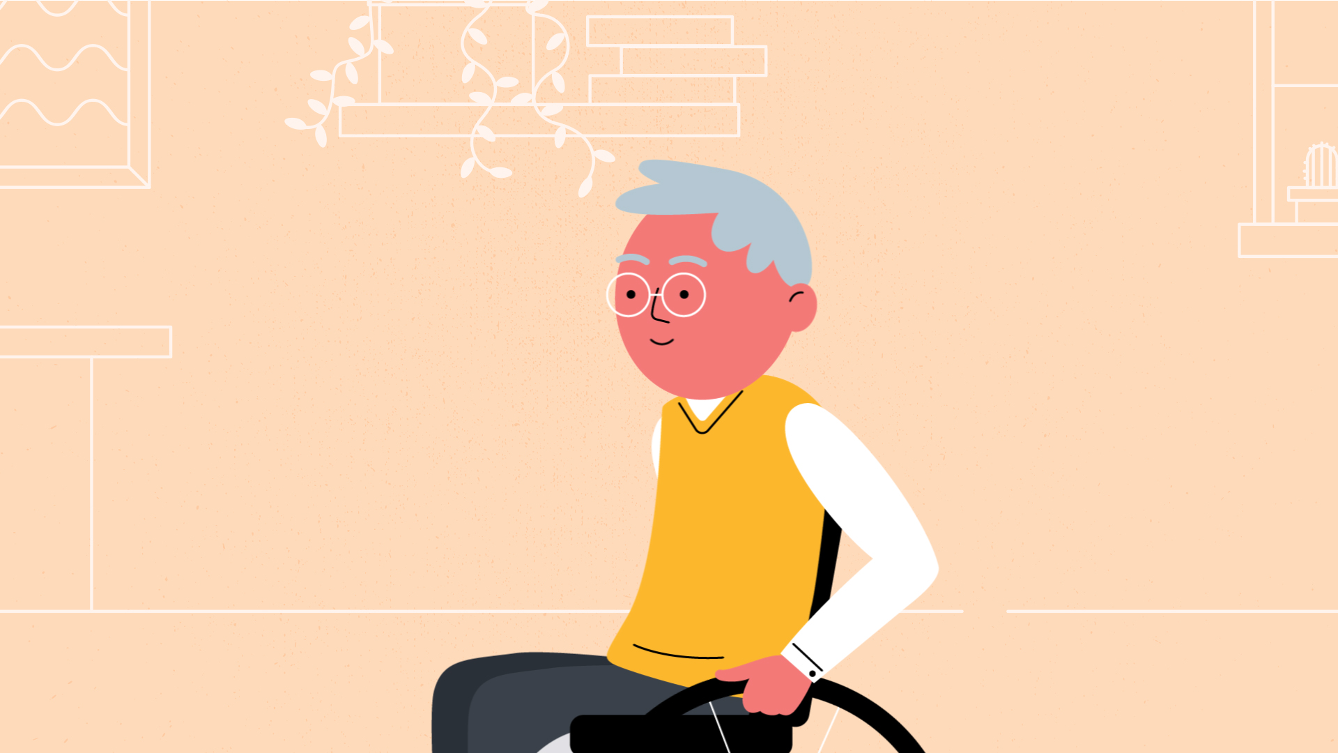
Character animation was key to representing the personalities in the case studies, and telling their stories.
Project Credits
- Storyboard, Illustration, and Animation by Shape
- Sound Design, Voiceover Recording, and Post Audio Processing by John Sanfilippo
- Script by Lee Tunstall
Logo Collection
- Branding
A collection of logos created over the years for various clients.
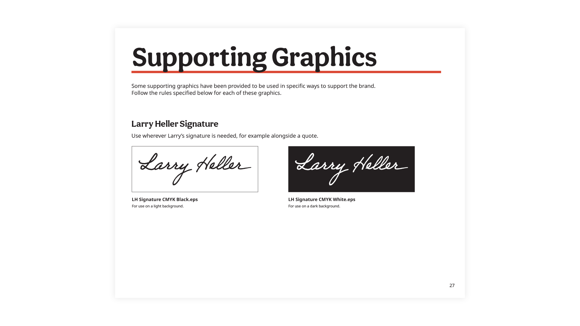
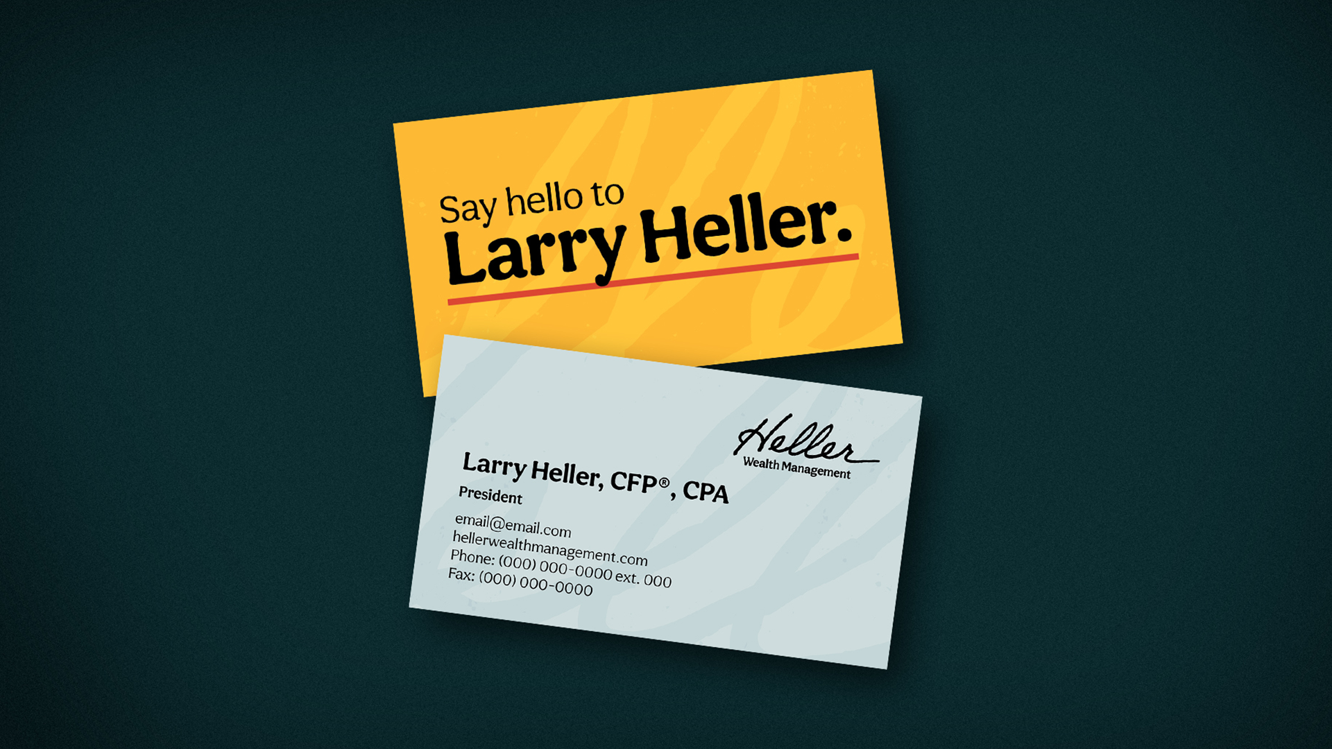
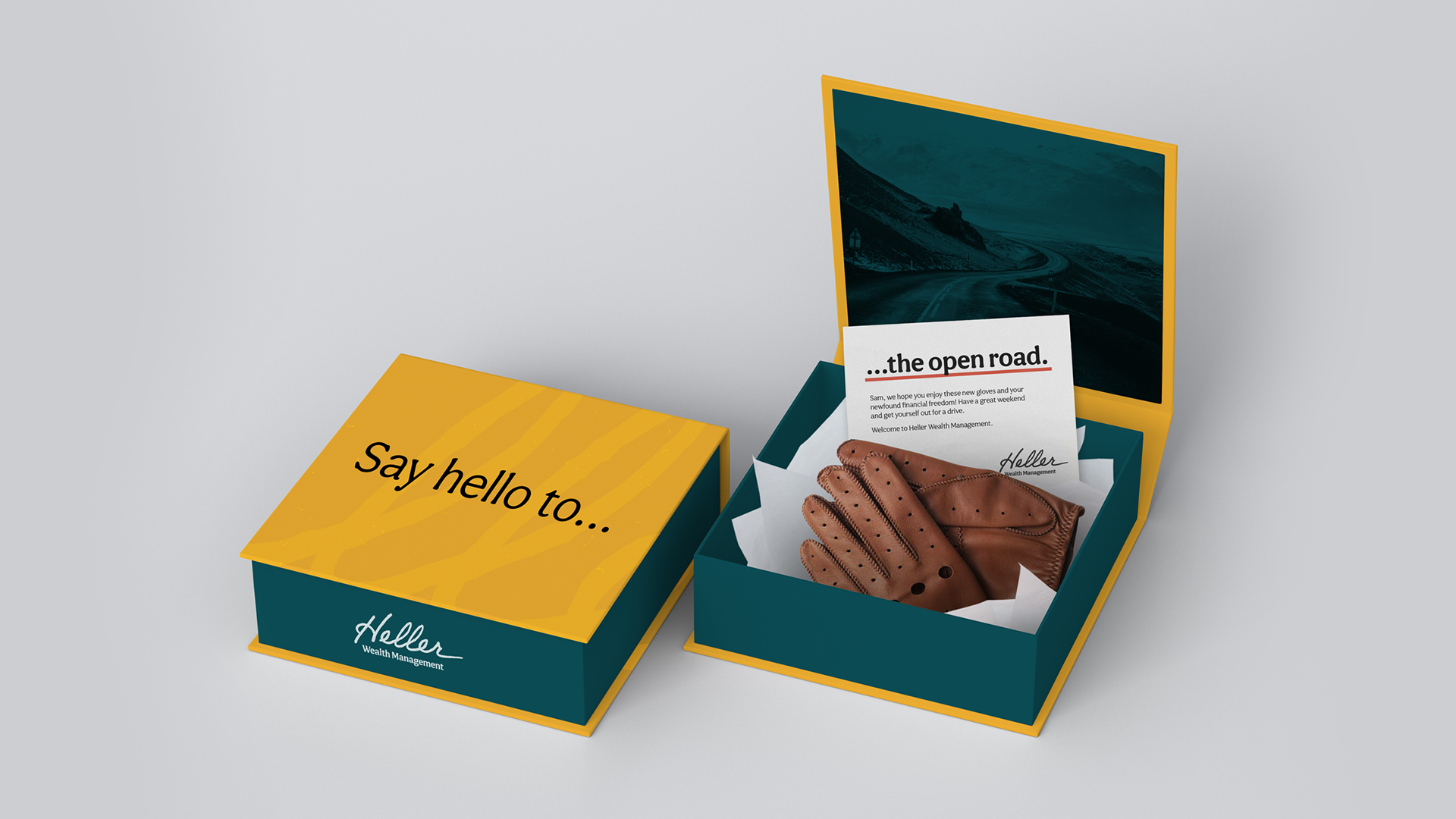
Heller Wealth Management
- Branding
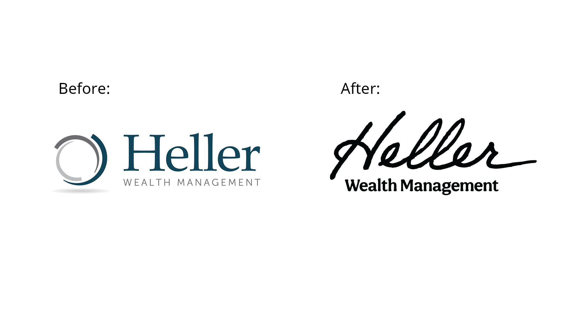
Heller Wealth Management is a wealth management company based in New York.
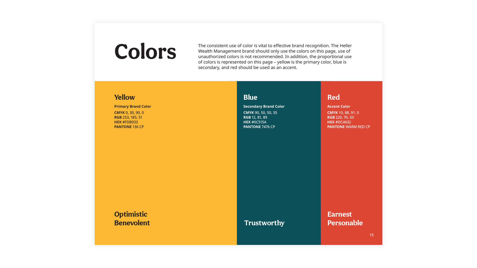
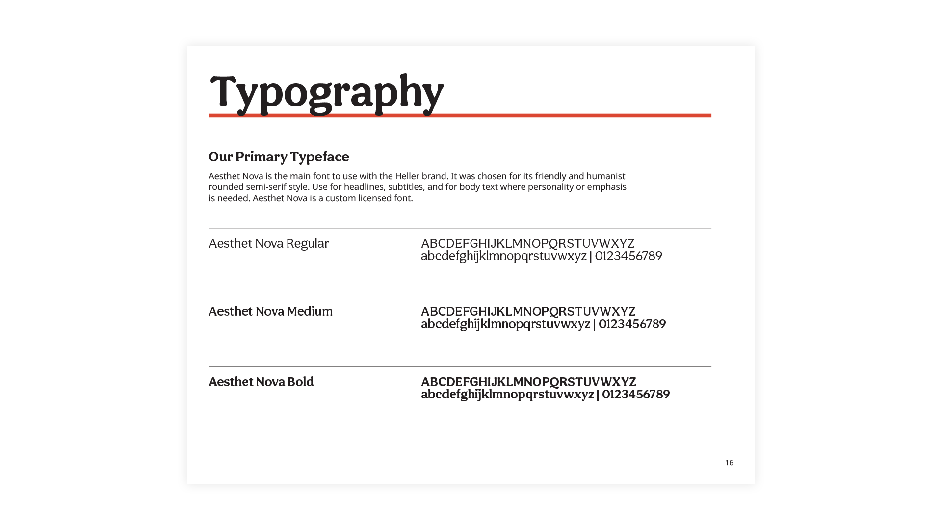
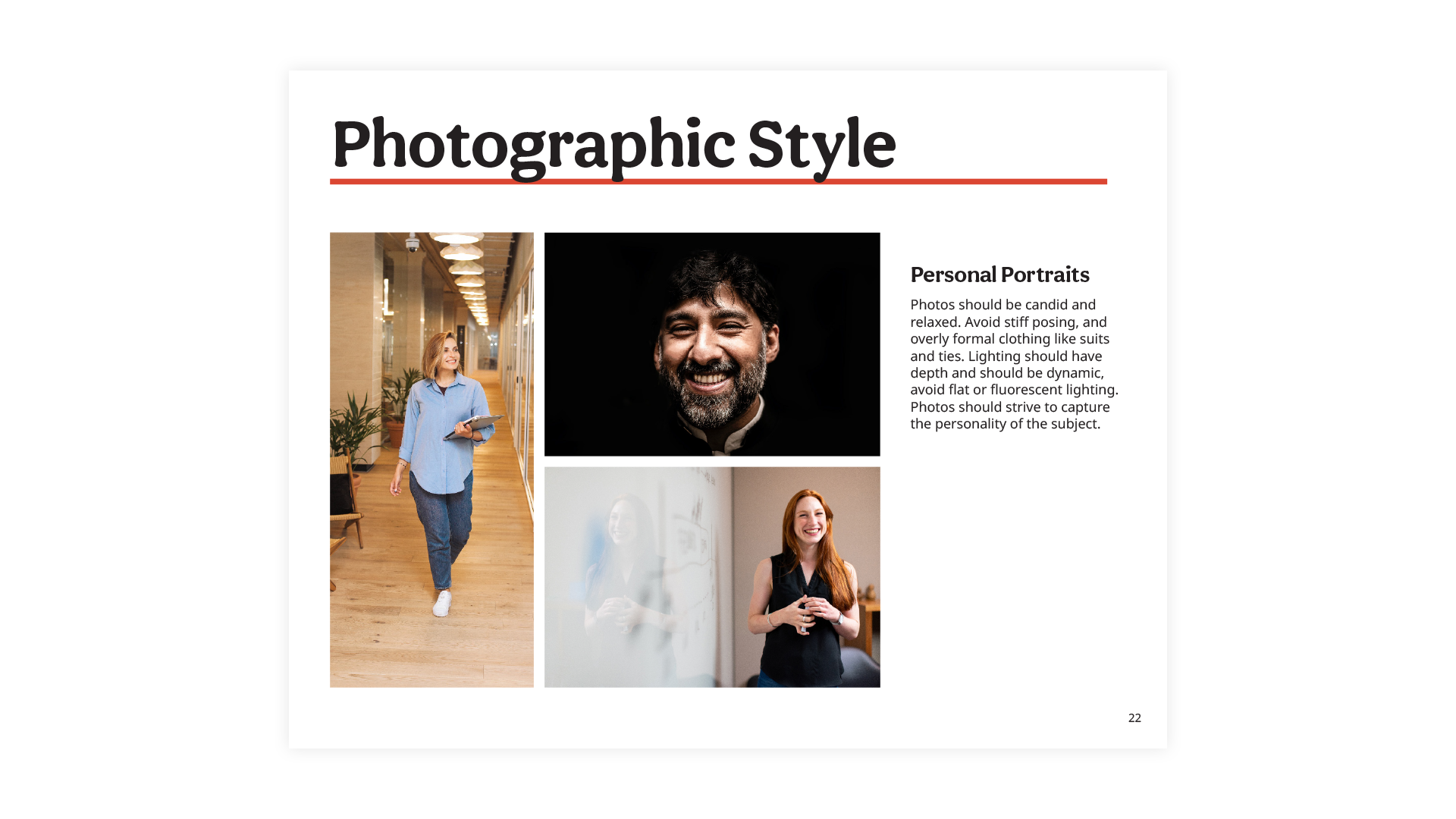
They serve Americans with aspirations to live their later life to the fullest, whether they’re starting new business ventures or travelling the world. The positioning of their brand had already been completed, but they needed a new visual brand and identity guide to reflect their new messaging. Their old brand blended into the homogenous blue/grey landscape of wealth management companies. The new brand expresses who they are as a humanist company, who makes real connections with their clients and helps them achieve their personal goals.
The colours, typography, and style of the supporting graphics were all carefully selected to project a feeling of warmth, security, and trust.
Project Credits
- Identity Design by Shape
- Brand Positioning, Project Management by Rob Howard
- Copywriting by Christopher Heatherington
PXR Conference Website
- Website

PXR started as a grand idea to gather live performance artists and technologists in virtual reality to talk about digital art making and innovating through content.
We wanted to design a bold website that complimented both the artistry and technology that is on display during the conference.
The homepage template features an animated blob slider that allows for any number of images to be cycled within.

Project Credits
Website design and development by Shape
innerme Illustrations
- Illustration
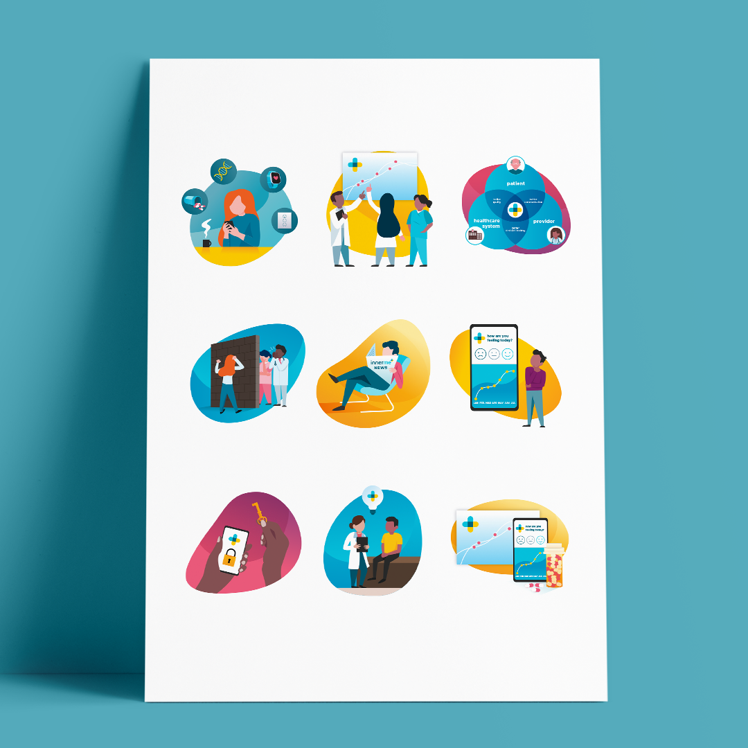
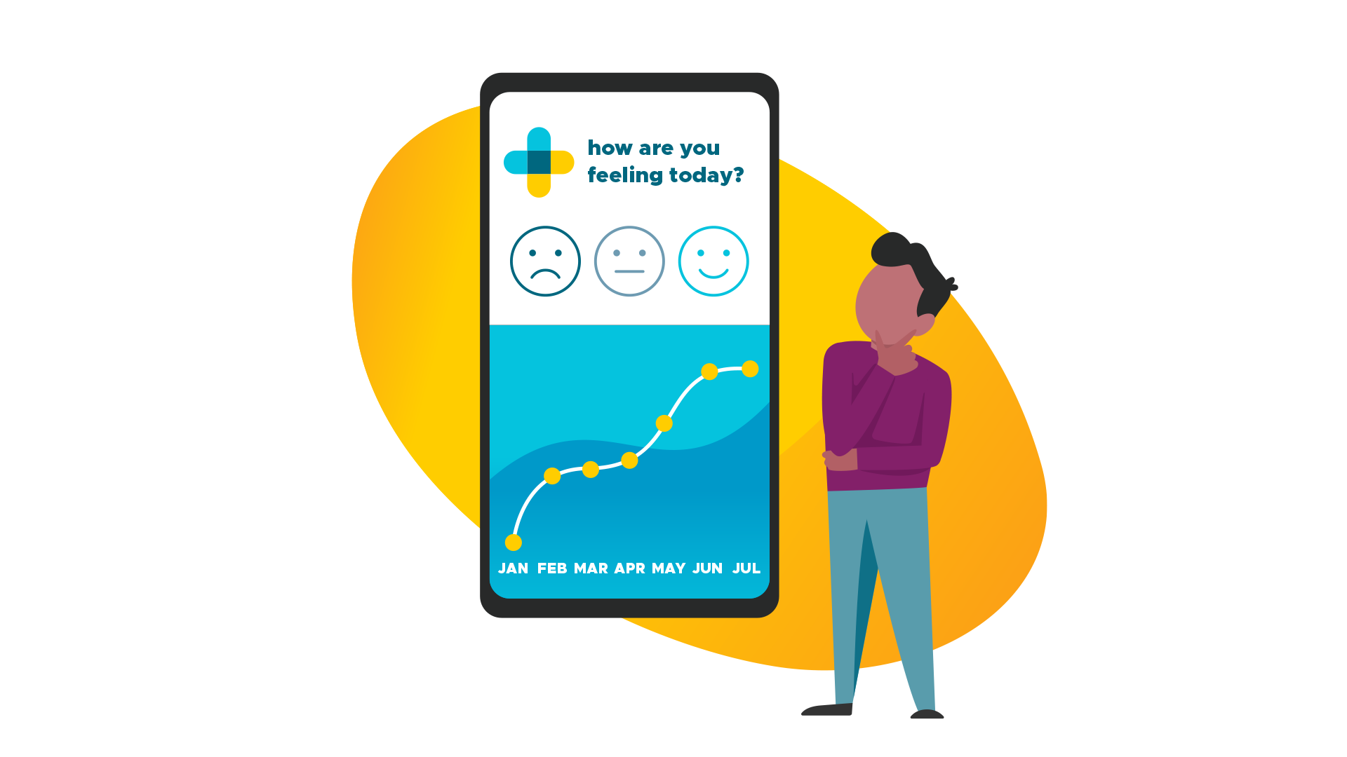
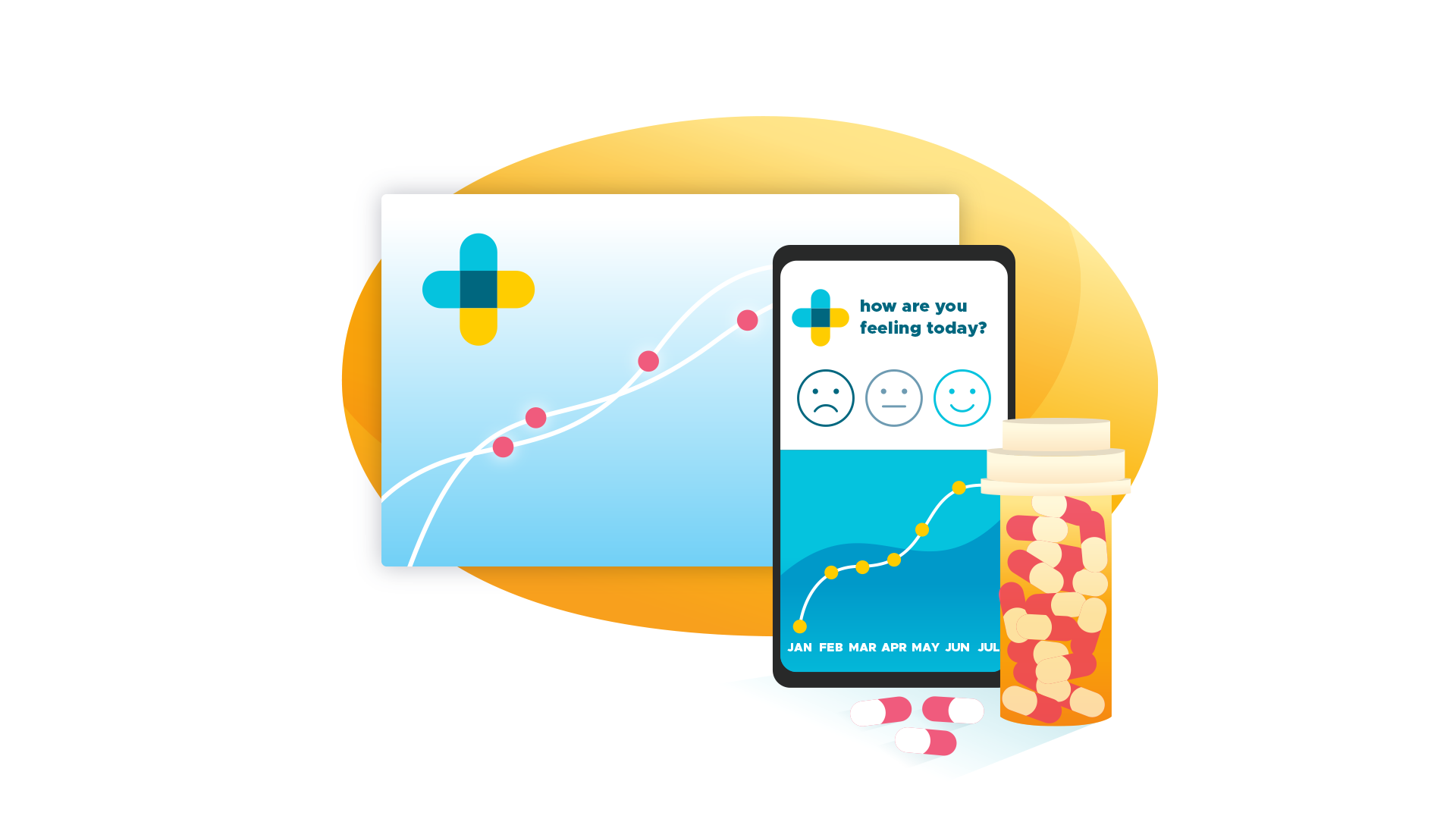
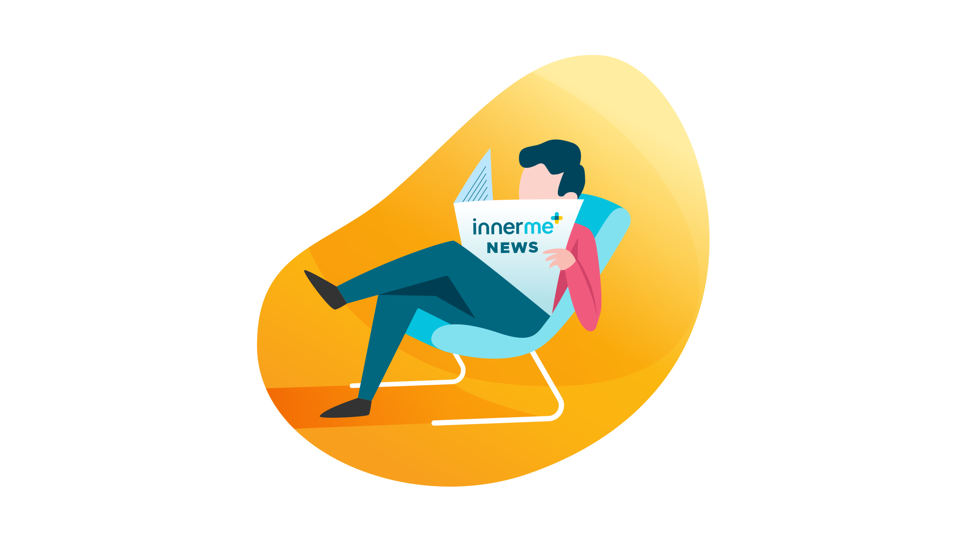
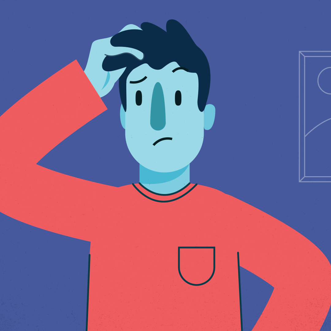
innerme is an app that allows communication and monitoring between doctors and patients with chronic conditions.
The app is extremely secure, allowing the user to choose how their data is shared, and giving the option to anonymously report data to help further research in the field of their particular illness. To help relate some of the problems experienced by patients, and the solutions provided by the platform, we decided to create some custom illustrations. The illustrations depict key concepts regarding the innerme platform, so although they were designed for the website, they can be easily repurposed to enhance presentations, brochures, pamphlets, and other advertising materials.
In keeping with the style of the brand, the colours are bright and vibrant. The signature blue and yellow are used throughout, with the addition of a complementary palette.


Project Credits
- Illustration by Shape
- Brand Design and Art Direction by Jon Allison
- Project Management by Rob Howard
OPEN Explanation Video
- Animation
- Illustration
Open Collaboration for Cognitive Accessibility has a mission to achieve parity for people of all cognitive abilities.
They are a one-stop shop for cognitive accessibility resources, expertise and advice. To help others understand the diversities of cognitive accessibility, Motion Designer Tara Pelow worked with them to create a video that would explain the concept, and would tell the story of who OPEN is, and their mission and vision.
We used a unique and charming character design style, and colours that are bright and fun, but still in line with the brand.
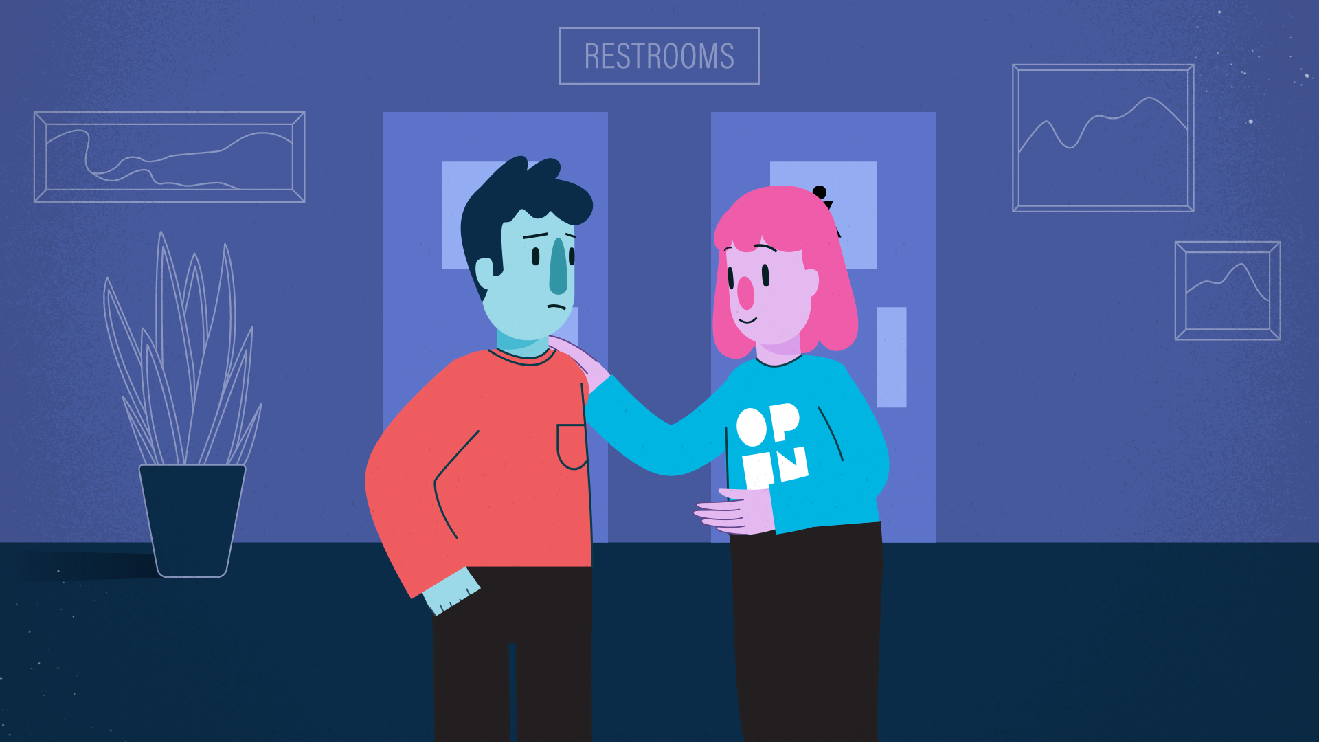
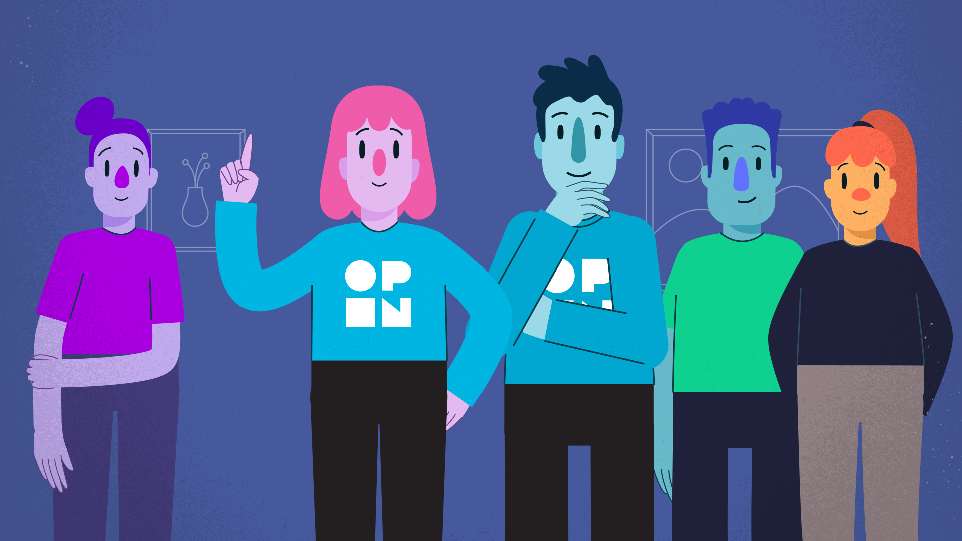

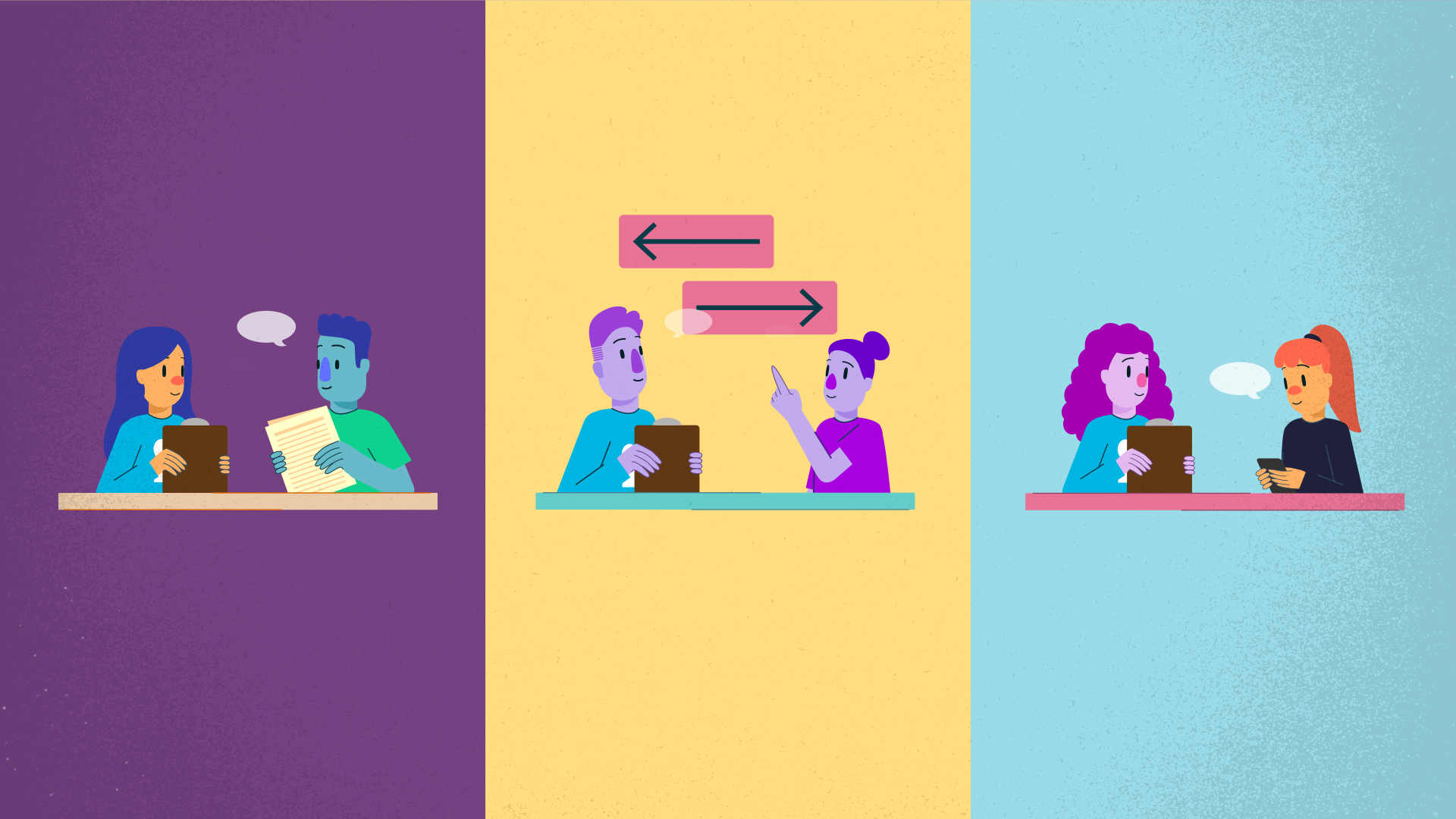
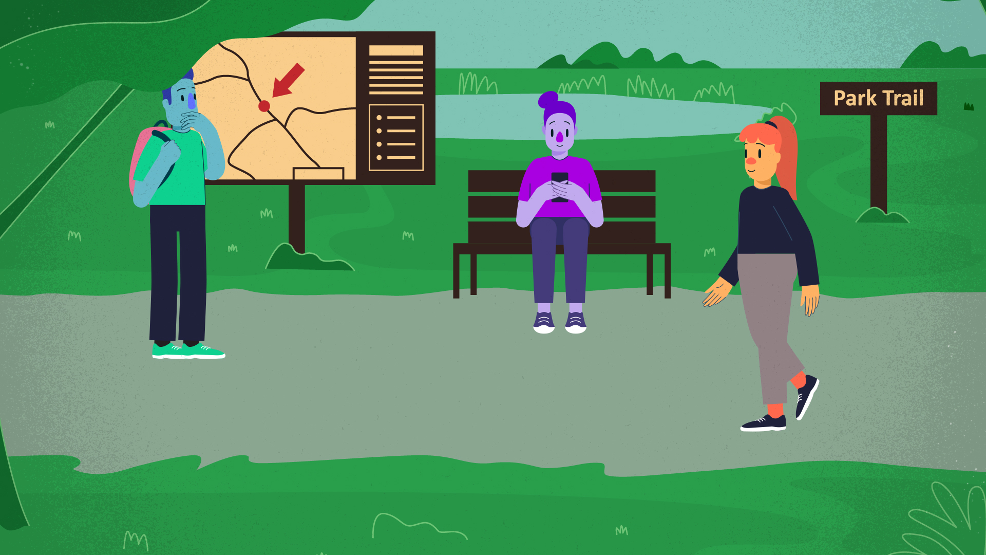
As cognitive accessibility is such a human-focused concept, we felt it important to make the video very character-rich.
Project Credits
- Storyboard, Illustration, and Animation by Shape
- Brand Design, Art Direction by Jon Allison
- Project Management by Rob Howard
- Voiceover Recording by John Sanfilippo
- Script by Christopher Heatherington
Spearhead G’Deh Label
- Illustration
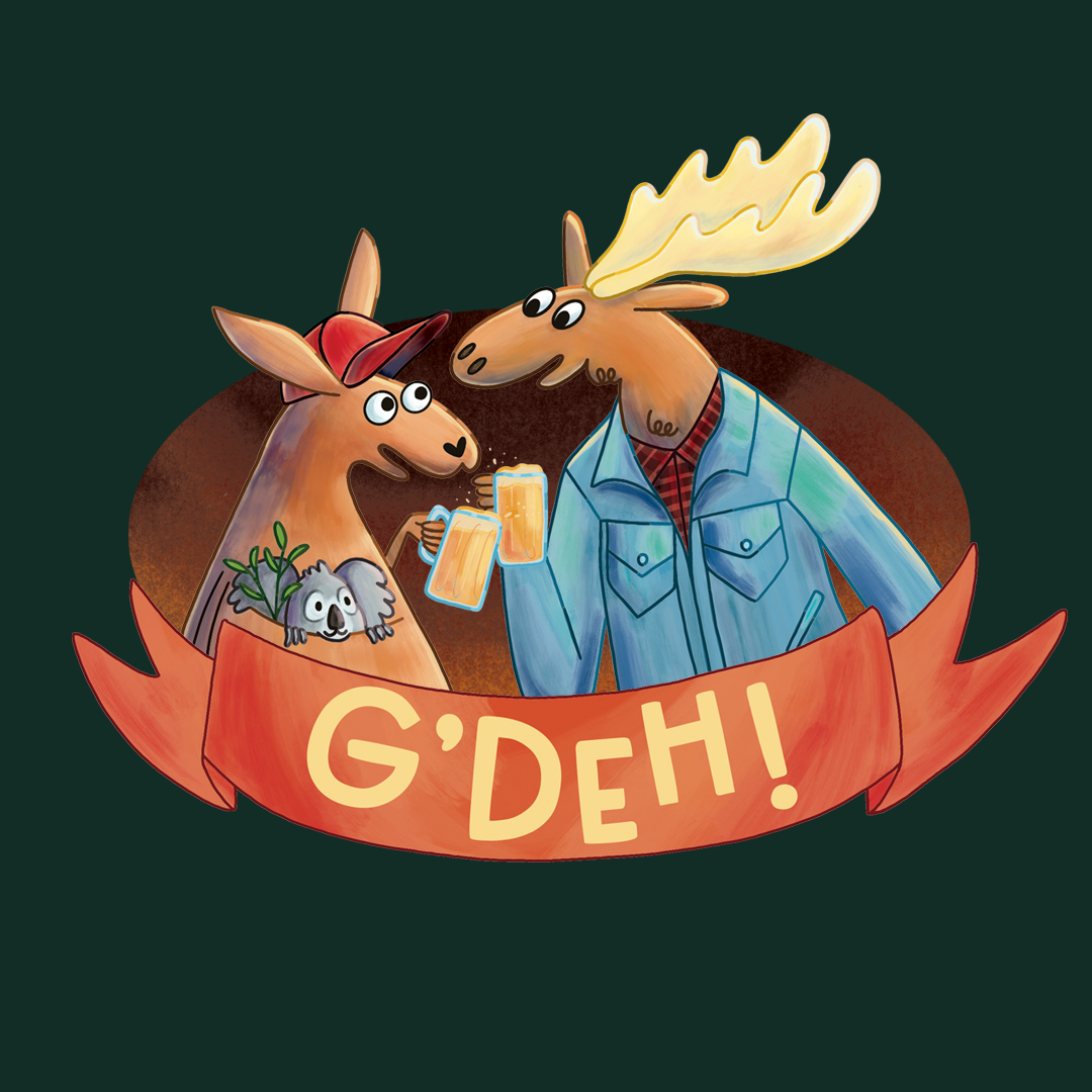
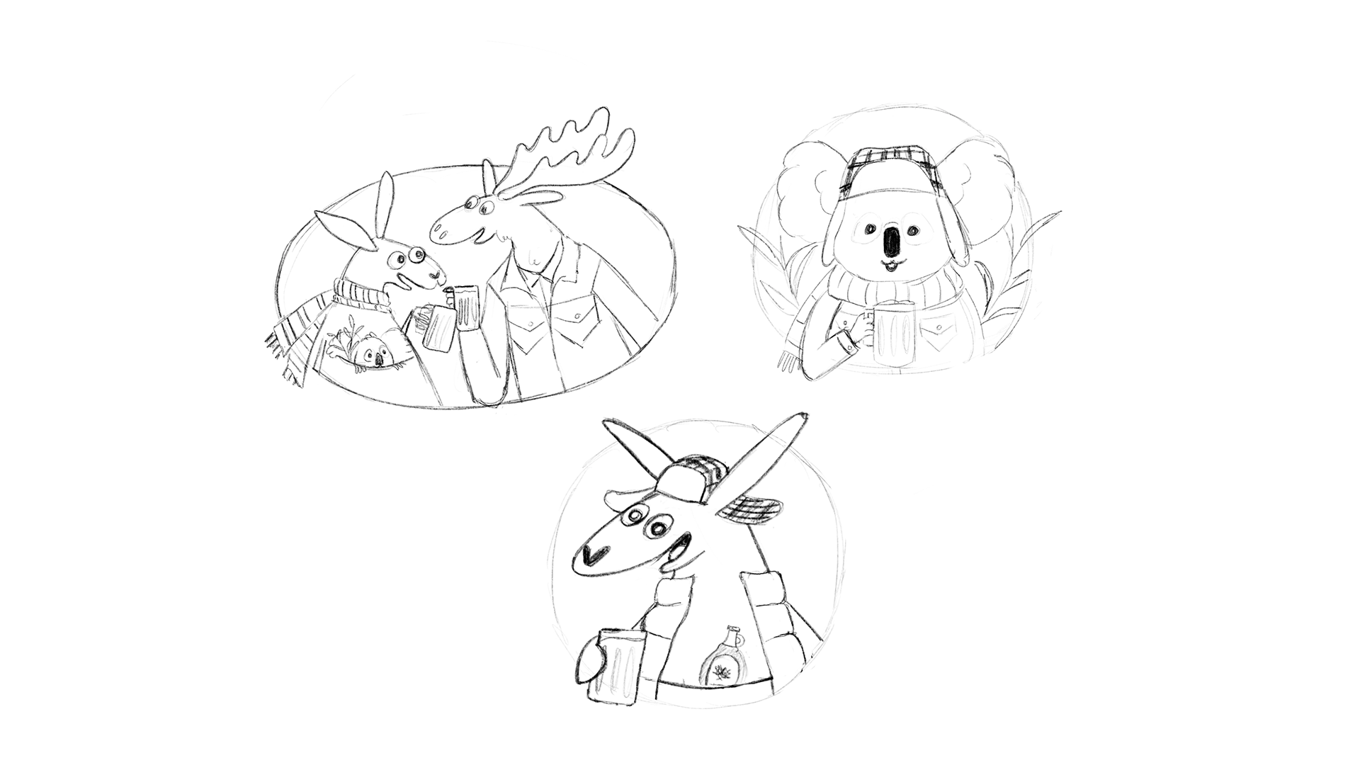
Spearhead Brewing Company was working on an exciting new limited-time beer called “G’Deh”, in collaboration with Australian brewery Sea Legs Brewing Co.
We wanted this illustration to be a little unusual, whimsical, and charming. This Aussie-Canadian collab was special, and what better way to represent their partnership than to depict a moose, a kangaroo and a koala sharing a beer? The label design is as creative and fun as the idea for this new brew.
We went with cartoony character designs, with a painterly rendering style. The scene depicted really shows the camaraderie between these characters and by extension the friendship between Australia and Canada.
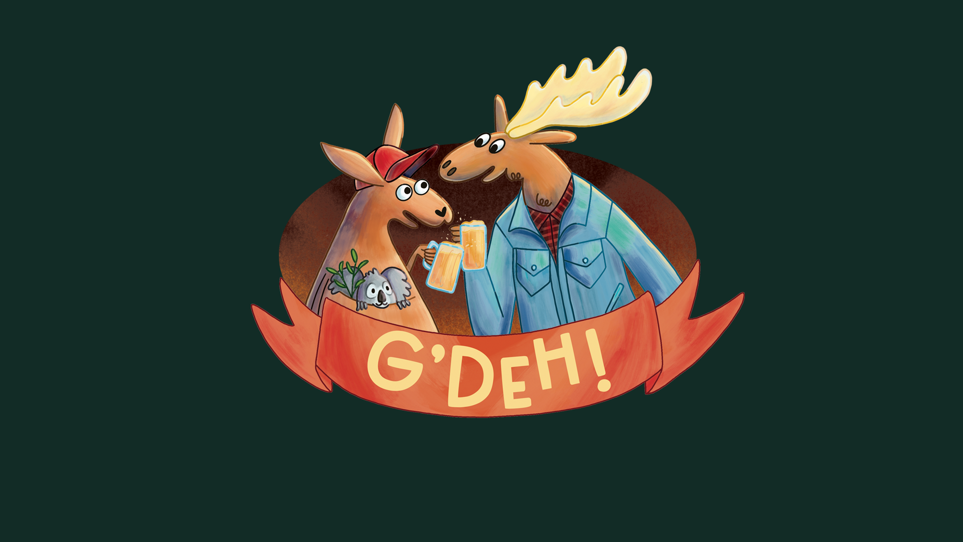
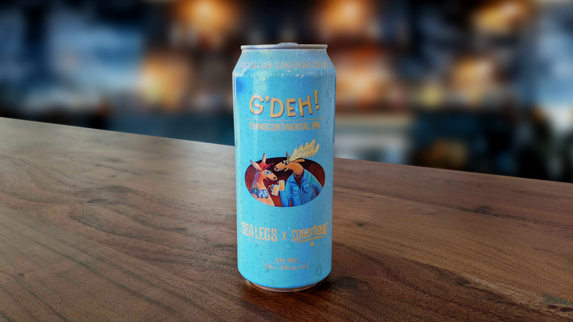
Project Credits
- Illustration by Shape
- Project Management by Lightbody Marketing
- Label Design by Spearhead Brewing Company
Fairmount Home
- Animation
Fairmount Home is a long term care home dedicated to resident-focused care. They empower their residents to make their own individual choices.
They needed a way to tell the story of who they are as a brand in a meaningful and engaging way. To help them achieve this goal, motion designer Tara Pelow took the project from initial storyboard, to artwork creation, to a final animated video showcasing their brand and their philosophies.
The entirety of the video features custom illustration, designed to carefully adhere to the brand standards.
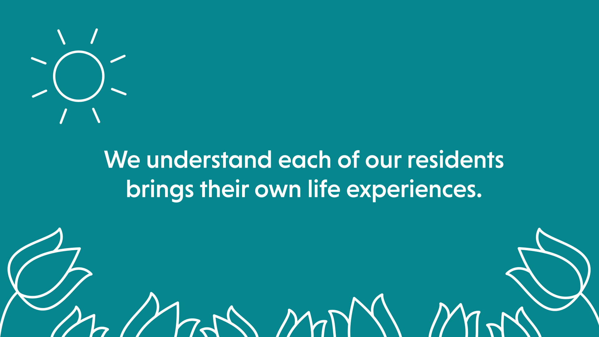
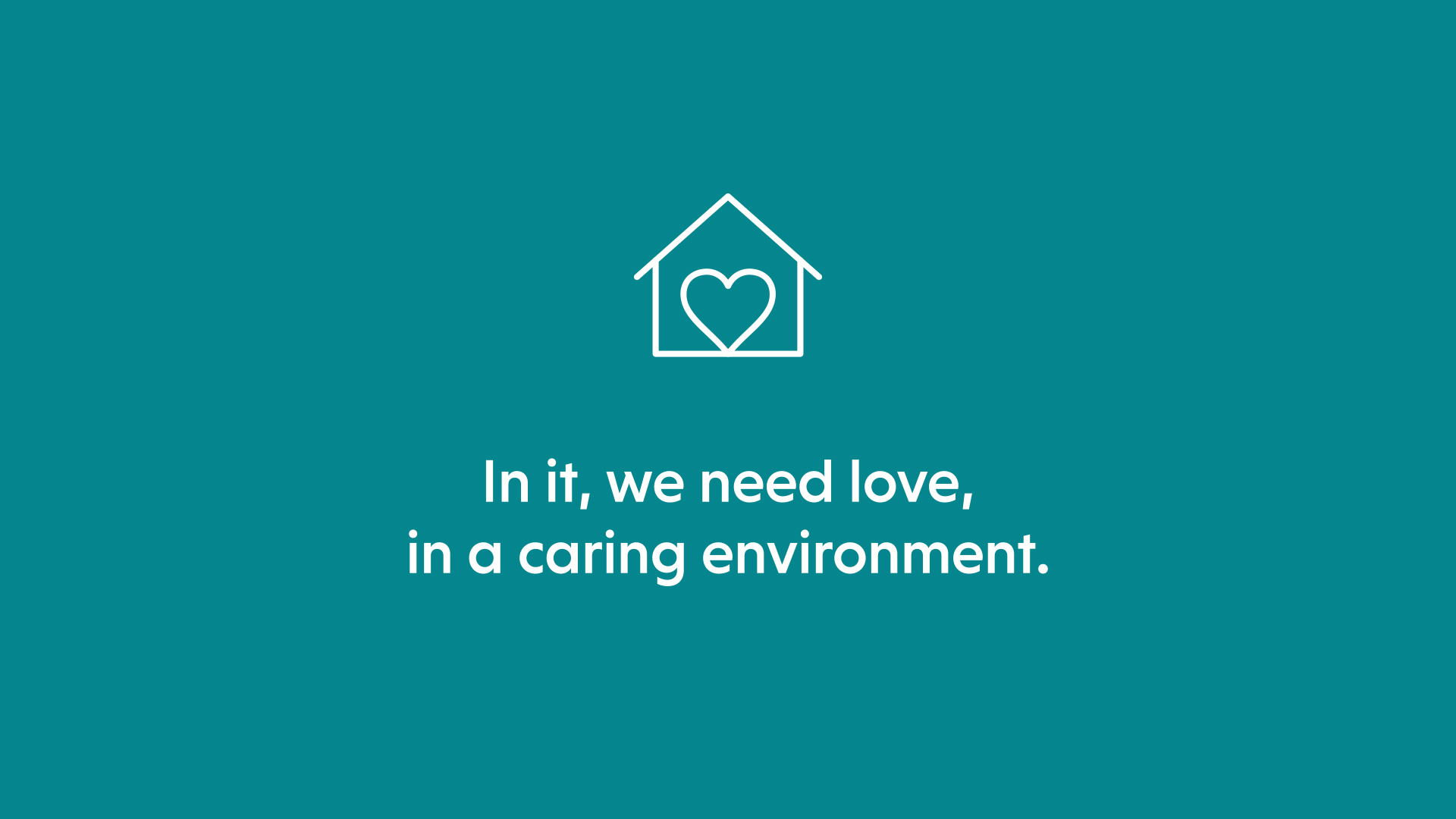
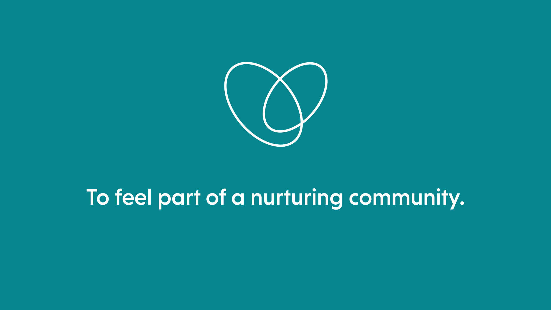
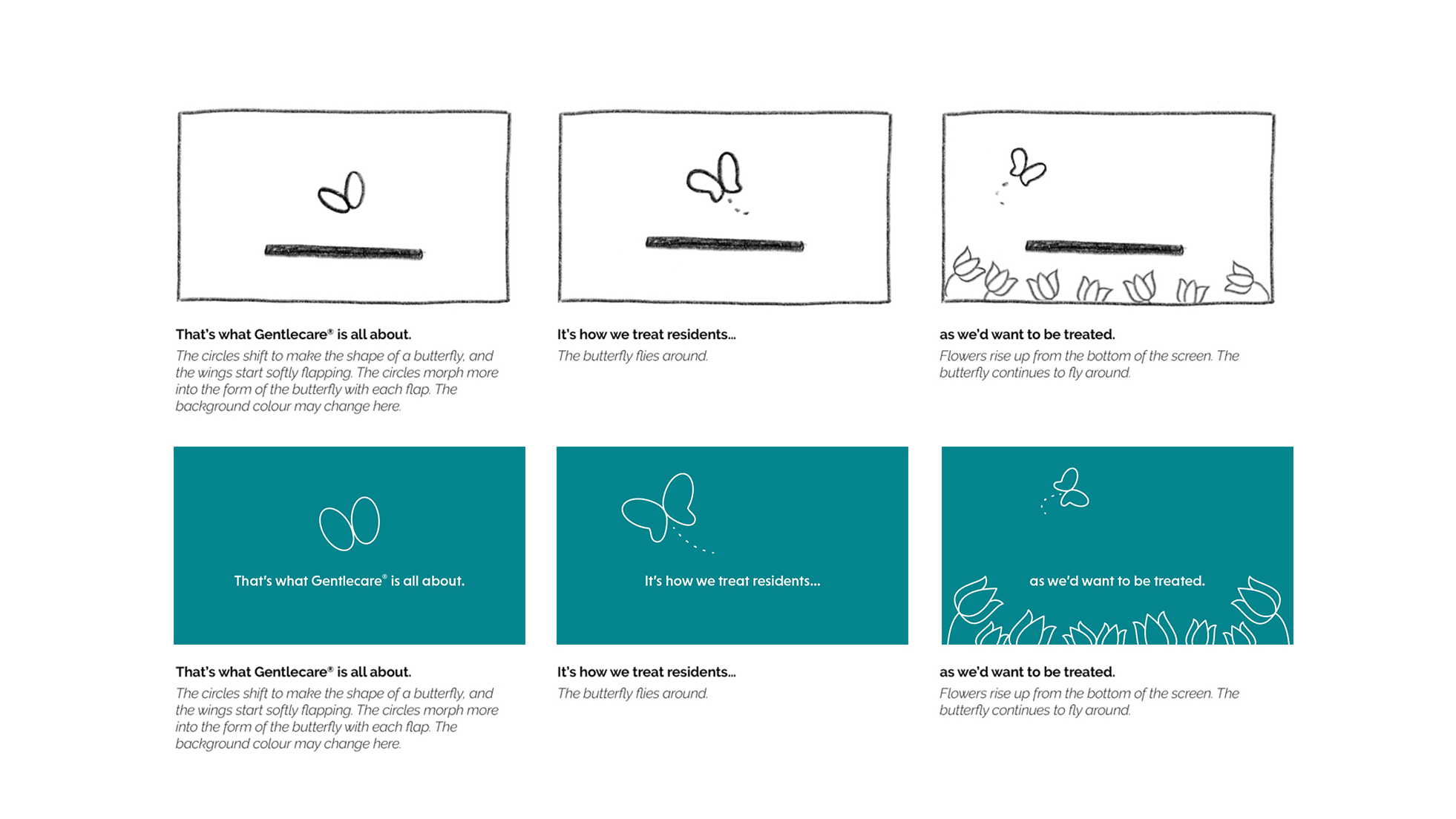
The illustrations were then used in the animation process of the video. The end result is a video that beautifully and honestly tells the story of Fairmount Home.
Project Credits
- Storyboard, Illustration, and Animation by Shape
- Brand Design and Art Direction by Jon Allison
- Script by Charles Blackwell
BNA Debt Solutions
- Animation
- Illustration

BNA Debt Solutions needed a short video to advertise their Consumer Proposal service on Youtube, facilitated by Youtube advertising experts Factor One Marketing.
We needed to condense a complex and sometimes even intimidating subject into a concise script that communicated the service in an entertaining and lighthearted way. Tara Pelow and Factor One collaborated on the script, then Tara created the storyboards, artwork, and animation.
The illustrations in this video are all fully custom, and carefully designed to communicate the key concepts involved with a consumer proposal.
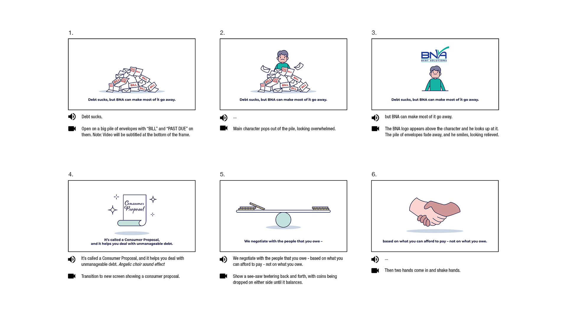

Once the artwork was approved, it was used in the animation process; resulting in an effective video that consistently gets high conversion rates on Youtube.
Project Credits
- Storyboard, Illustration, and Animation by Shape
- Script and Project Management by Factor One
- Sound Design, Voiceover Recording, and Post Audio Processing by John Sanfilippo
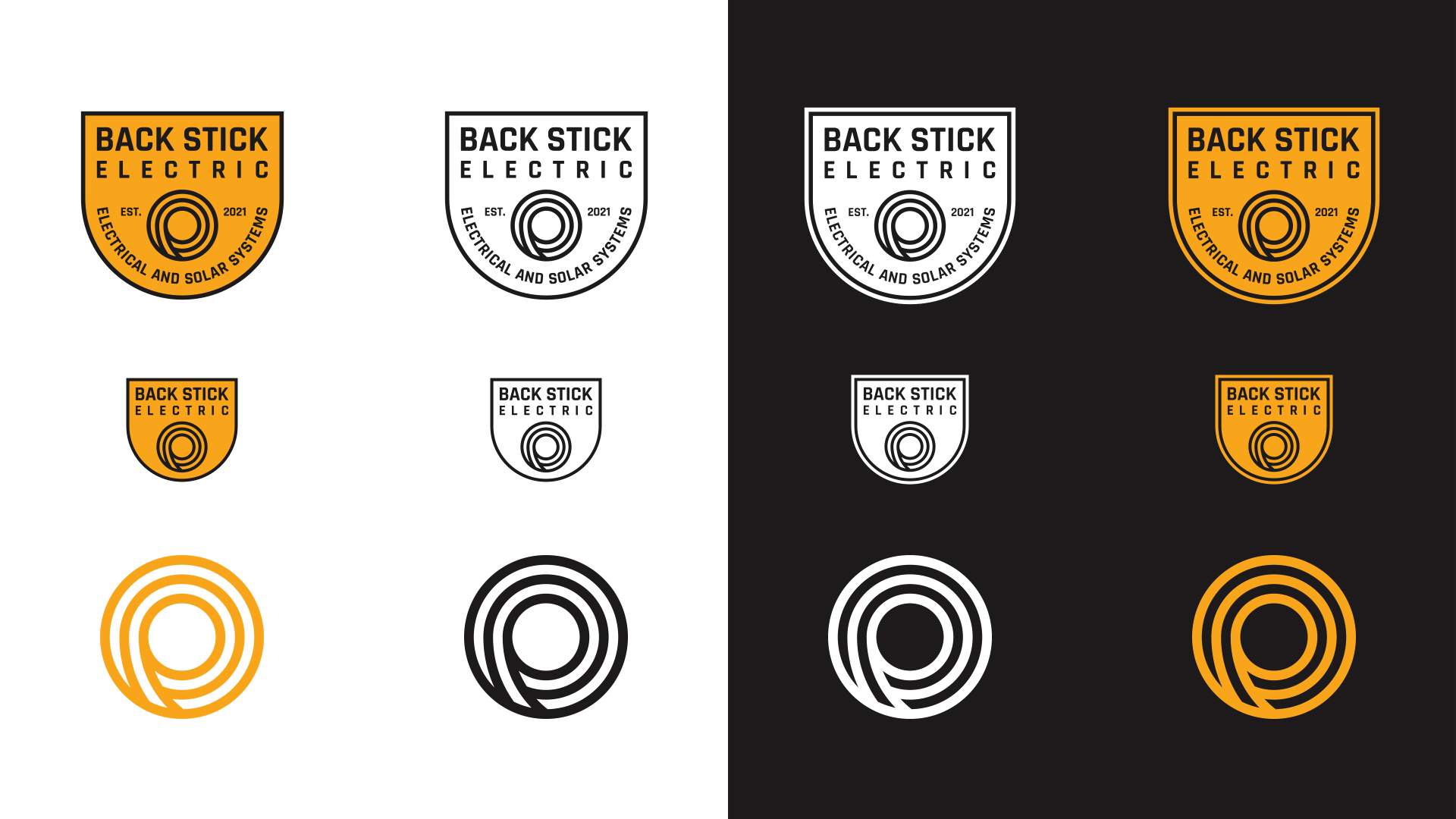
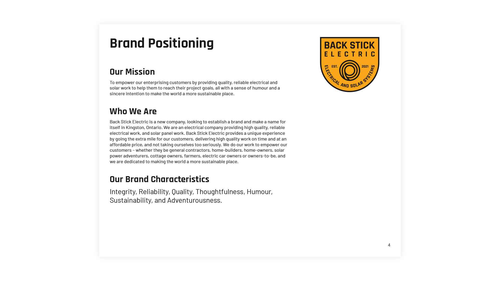
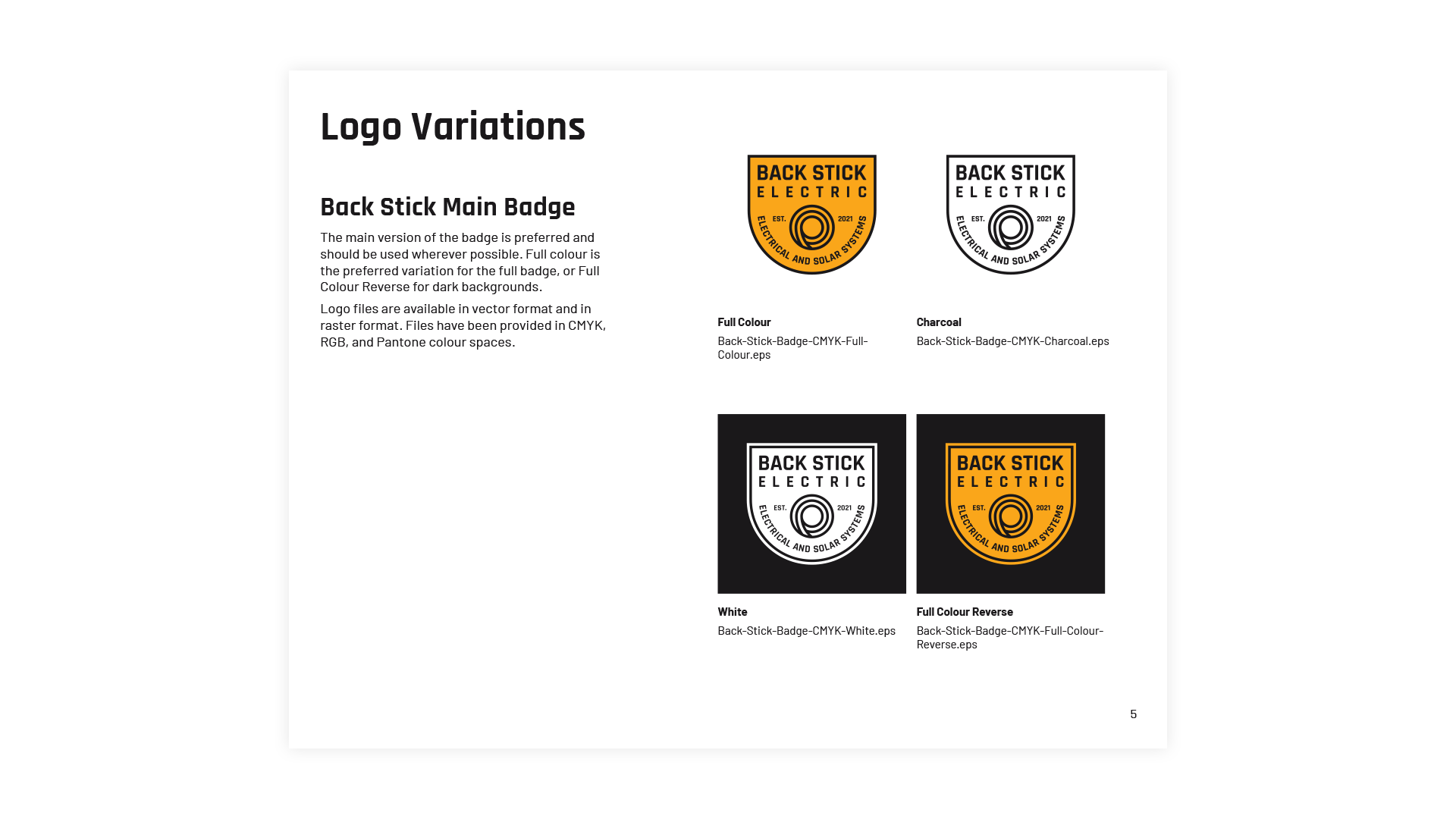
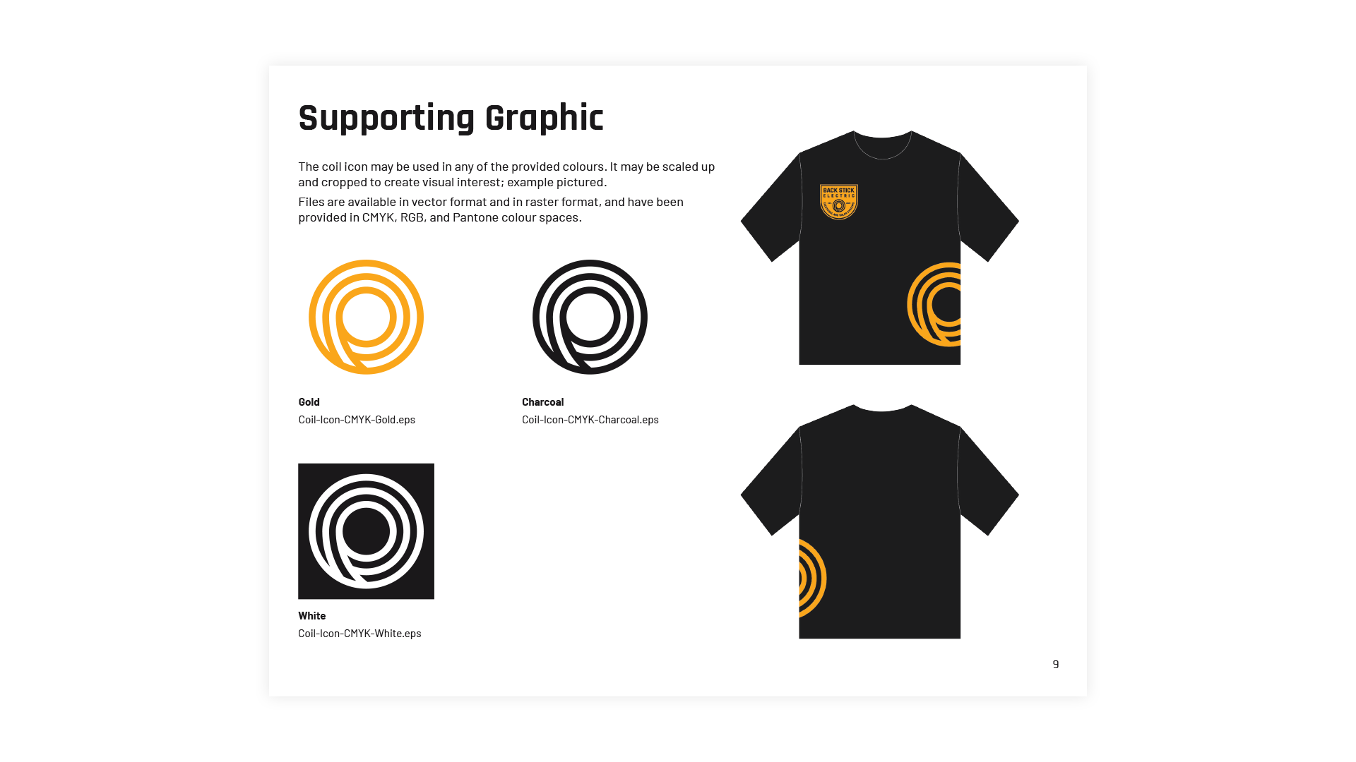
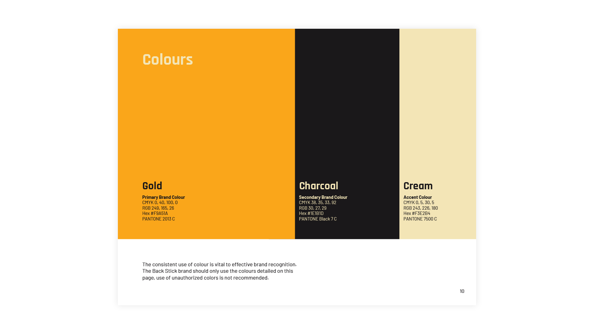
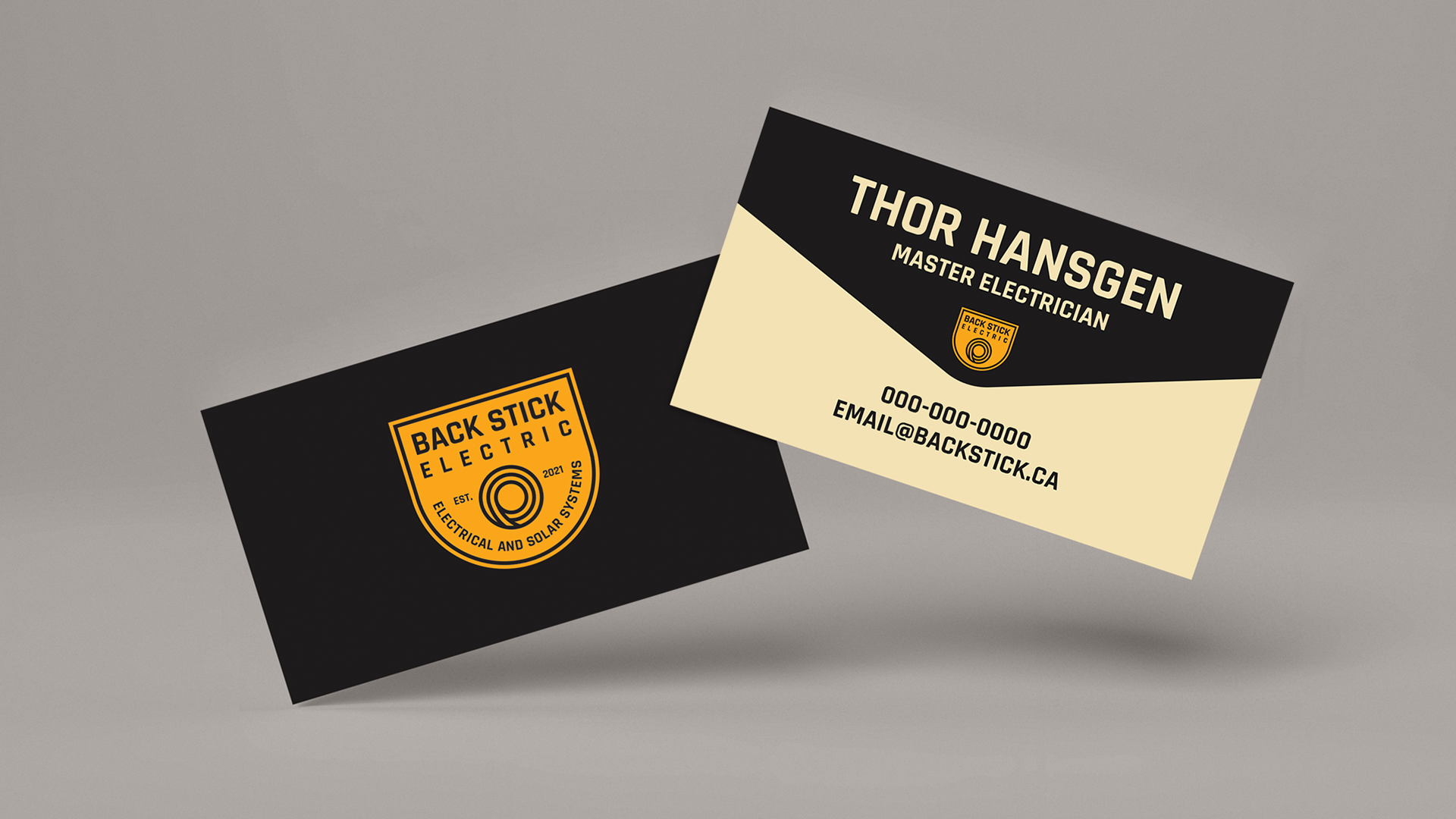
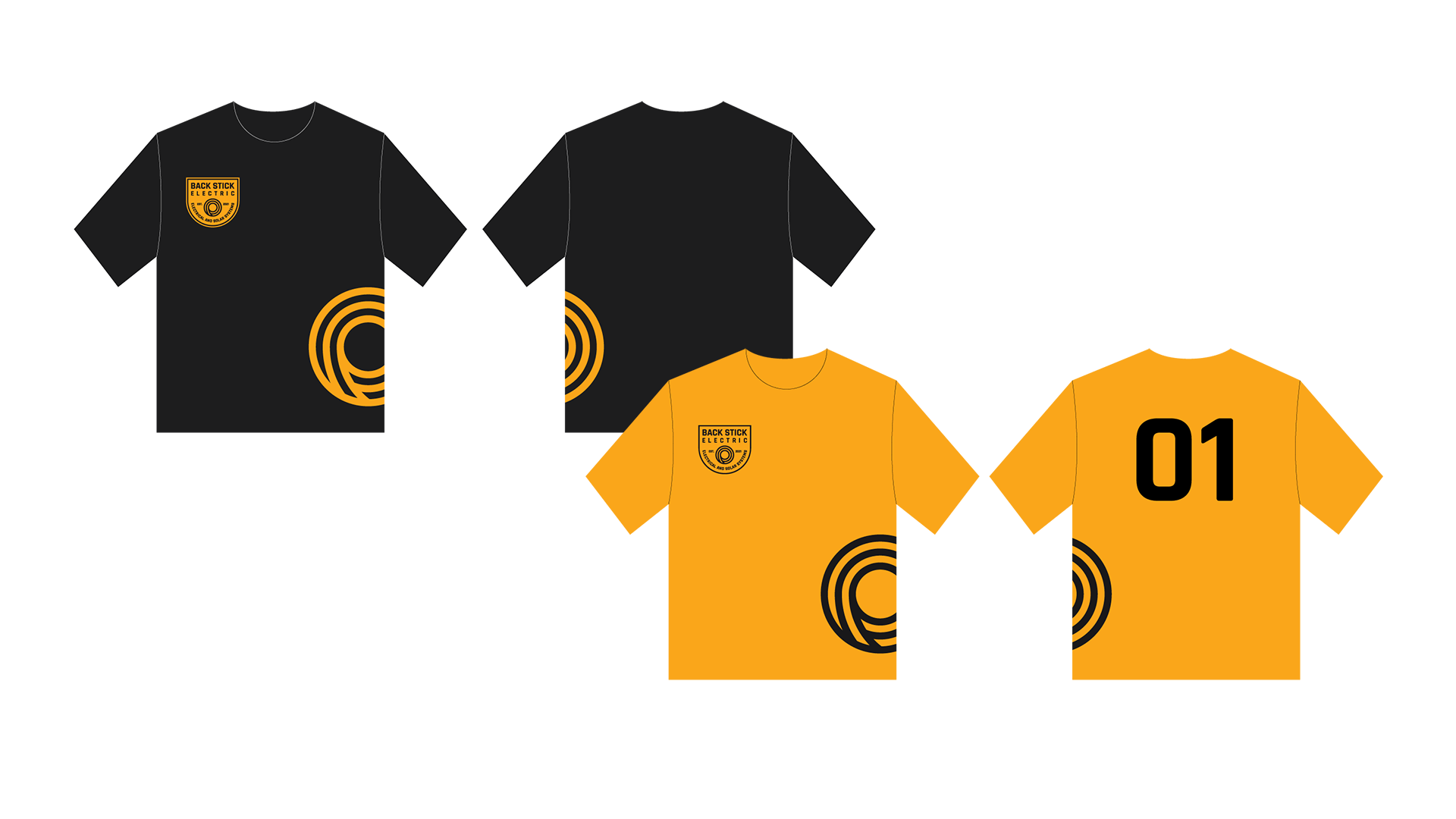
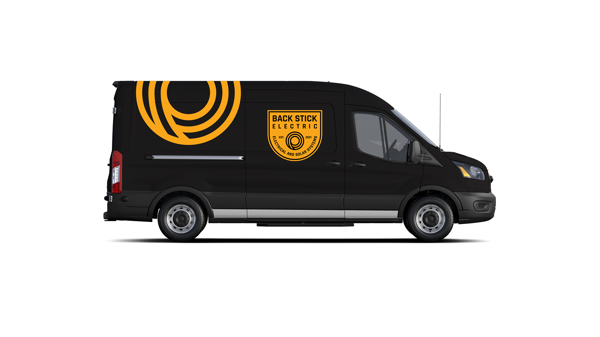
Back Stick Electric
- Branding
Back Stick Electric is an electrical company providing general electrician services, as well as solar panel work.
They really go the extra mile for their customers, delivering high-quality work on time and at an honest price, and they don’t take themselves too seriously either. As an original spin on electrical iconography, we decided to forgo the typical “lightning bolt” imagery and created a unique icon featuring a coiled electrical wire. We went with a vintage badge design, which invokes a sense of trust, sturdiness, reliability, and integrity. This brand has a classic look with modern cleanliness and will stand the test of time.
Fonts, colours and iconography were all selected to support the brand characteristics of trust and integrity. A variety of logo variations were also provided to account for any application.
Project Credits
Identity Design by Shape
Factor One Marketing
- Animation
- Illustration
Factor One Marketing specializes in Youtube marketing, and the time had come for them to run their own ad.
The key was to condense who they are and what they do into a short video that would hold the attention of the viewer. Factor One provided a great script, and Tara created the storyboards and artwork, hired Tyton Sound for the voiceover and sound design, and animated the video. Once the animation process was finally complete, we had an entertaining video that consistently gets great numbers on Youtube.
Colourful vector illustrations combined with an animated grainy texture gives a sense of warmth and friendliness.


Animated characters can make it easier to connect with the concepts being presented in your video.
Project Credits
- Storyboard, Illustration, and Animation by Shape
- Script by Factor One
- Sound Design, Voiceover Recording, and Post Audio Processing by John Sanfilippo
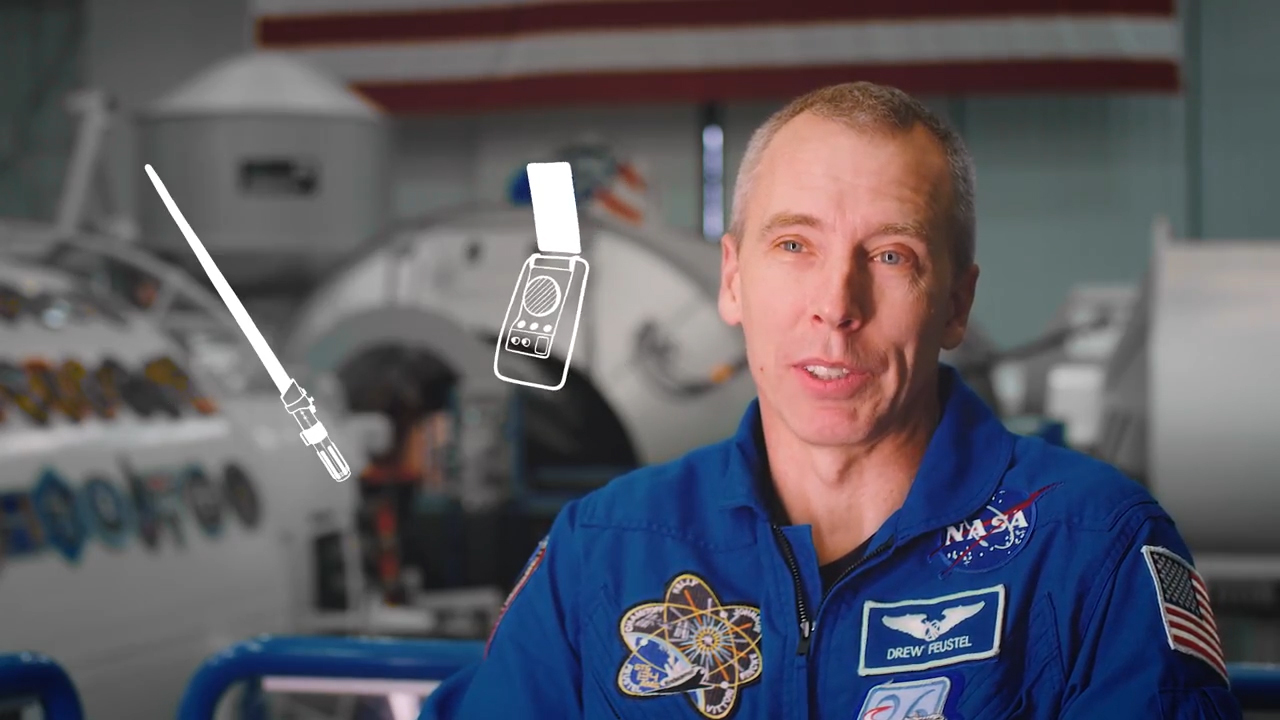
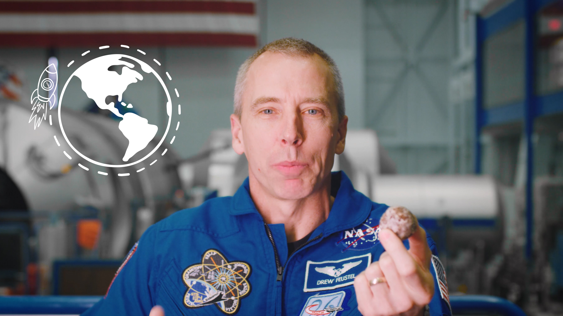
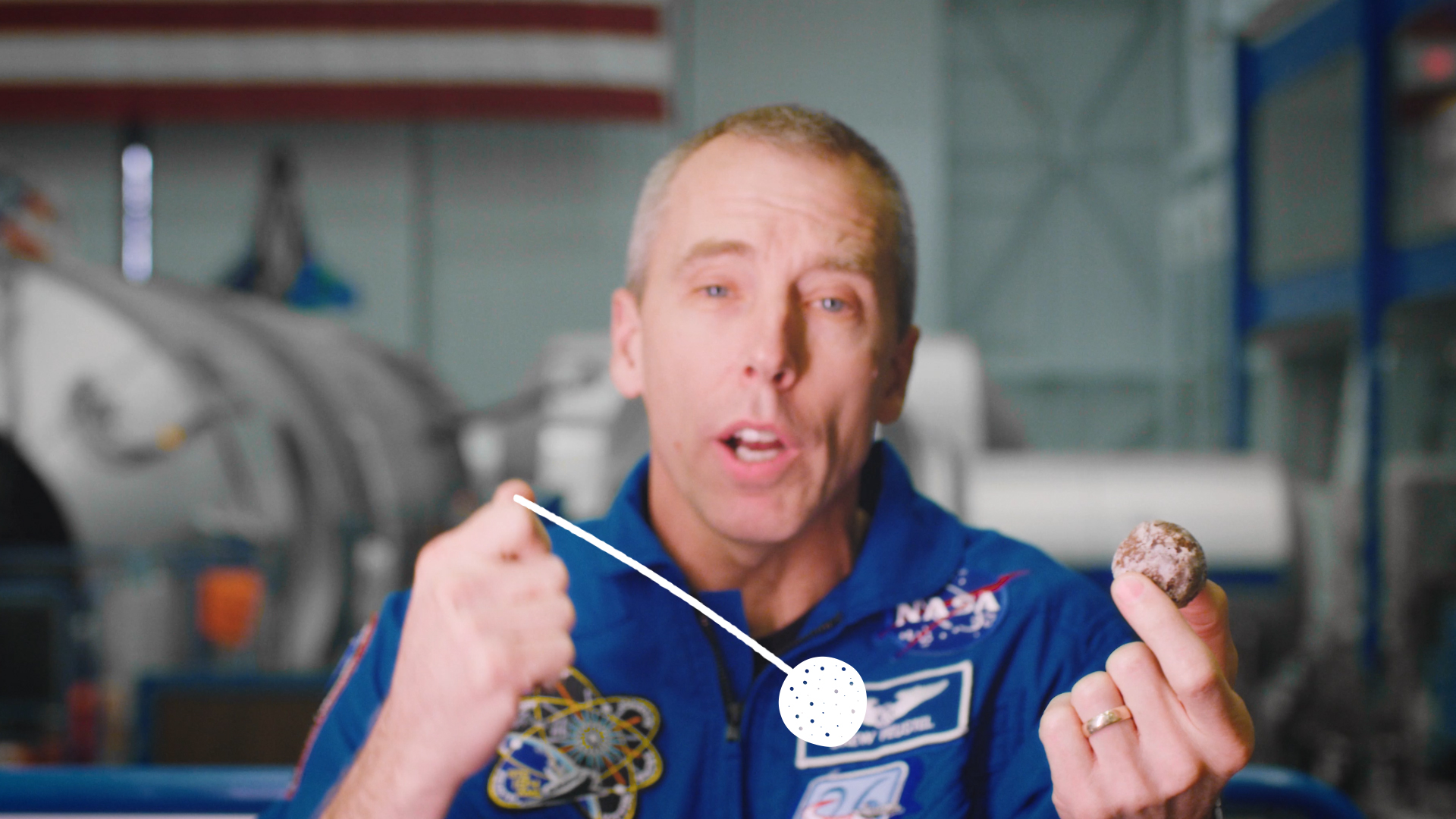
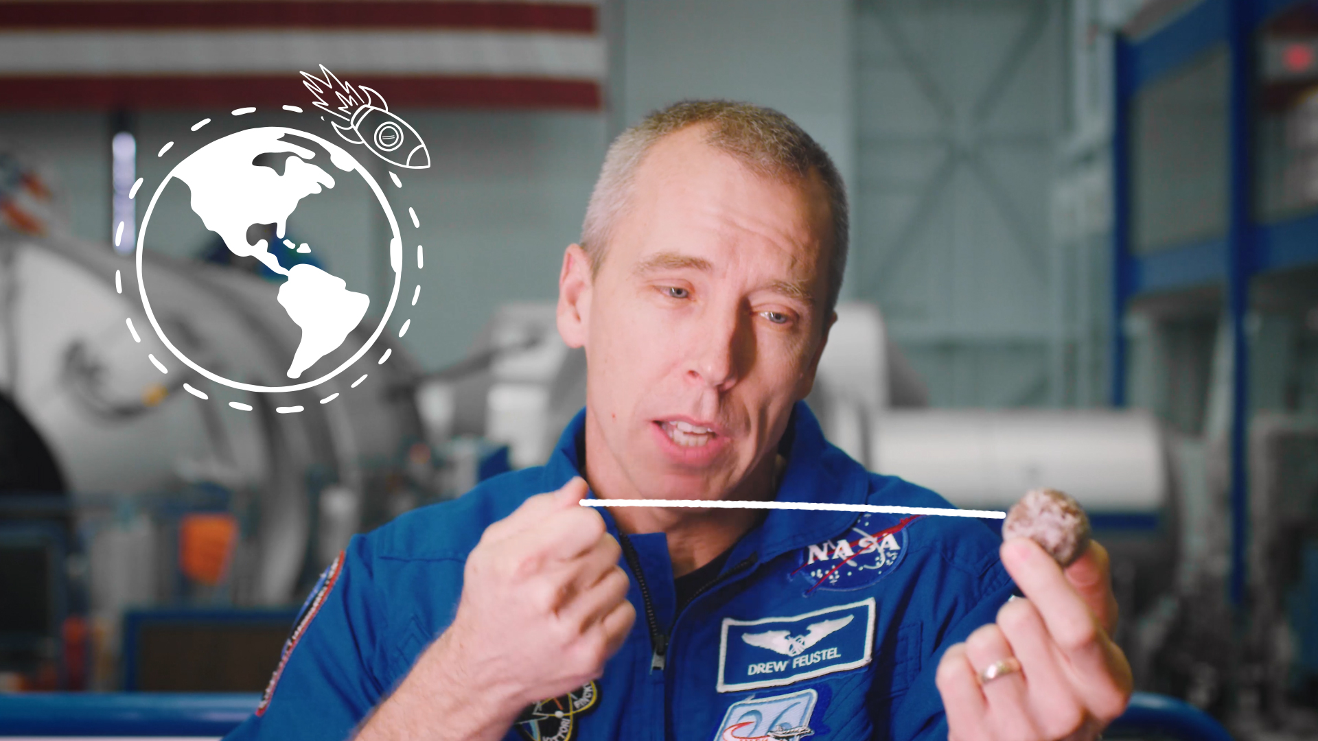
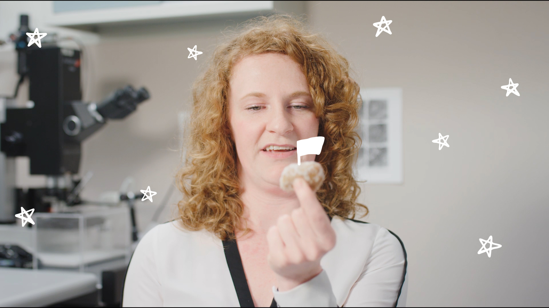
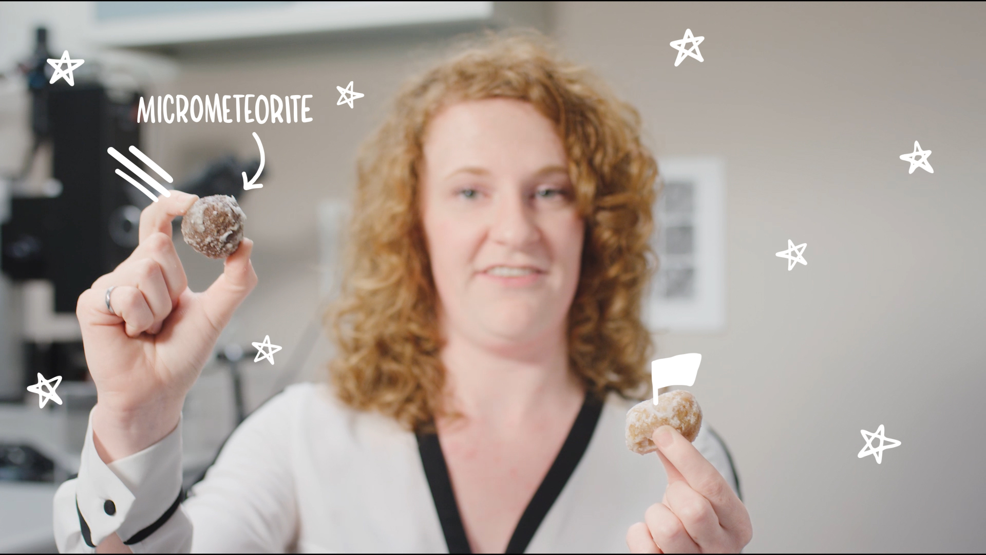
Queen’s University NASA Videos
- Animation
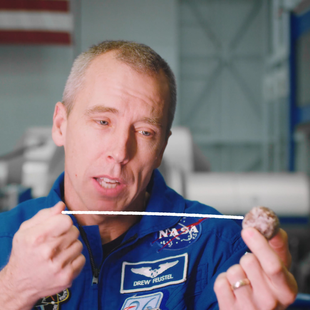
On April 6 2018, Queen’s University hosted a live Q&A with NASA Astronaut Drew Feustel, while aboard the International Space Station.
In preparation for the event, Untold Storytelling travelled to NASA to interview Drew while he was still here on Earth, as well as Dr. Michelle Thompson. To illustrate their anecdotes and enhance the stories they tell, Motion Designer Tara Pelow created hand drawn animations to overlay onto the footage.
A charming hand-drawn doodle style was used for these animations, drawing a connection with a “back of the napkin” sketch.
Project Credits
- Storyboard, Illustration, and Animation by Shape
- Project Direction, Video/Art Direction, and Cinematography by Untold Storytelling
- Post Audio Processing by John Sanfilippo
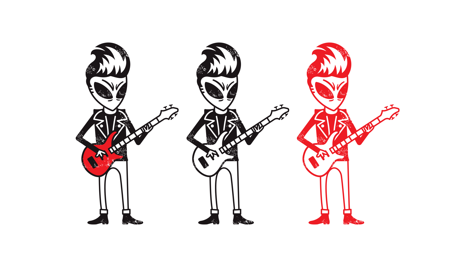
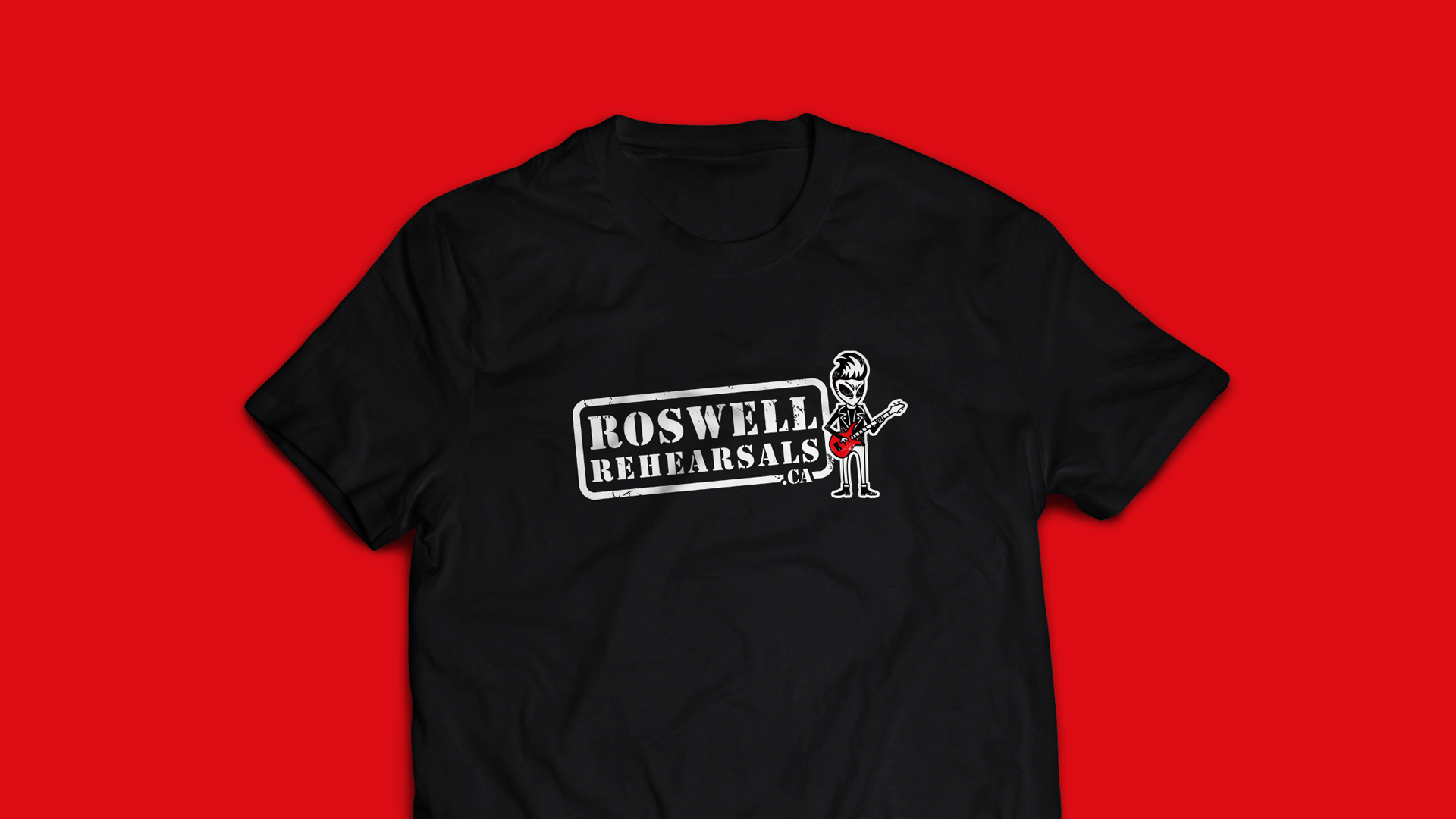
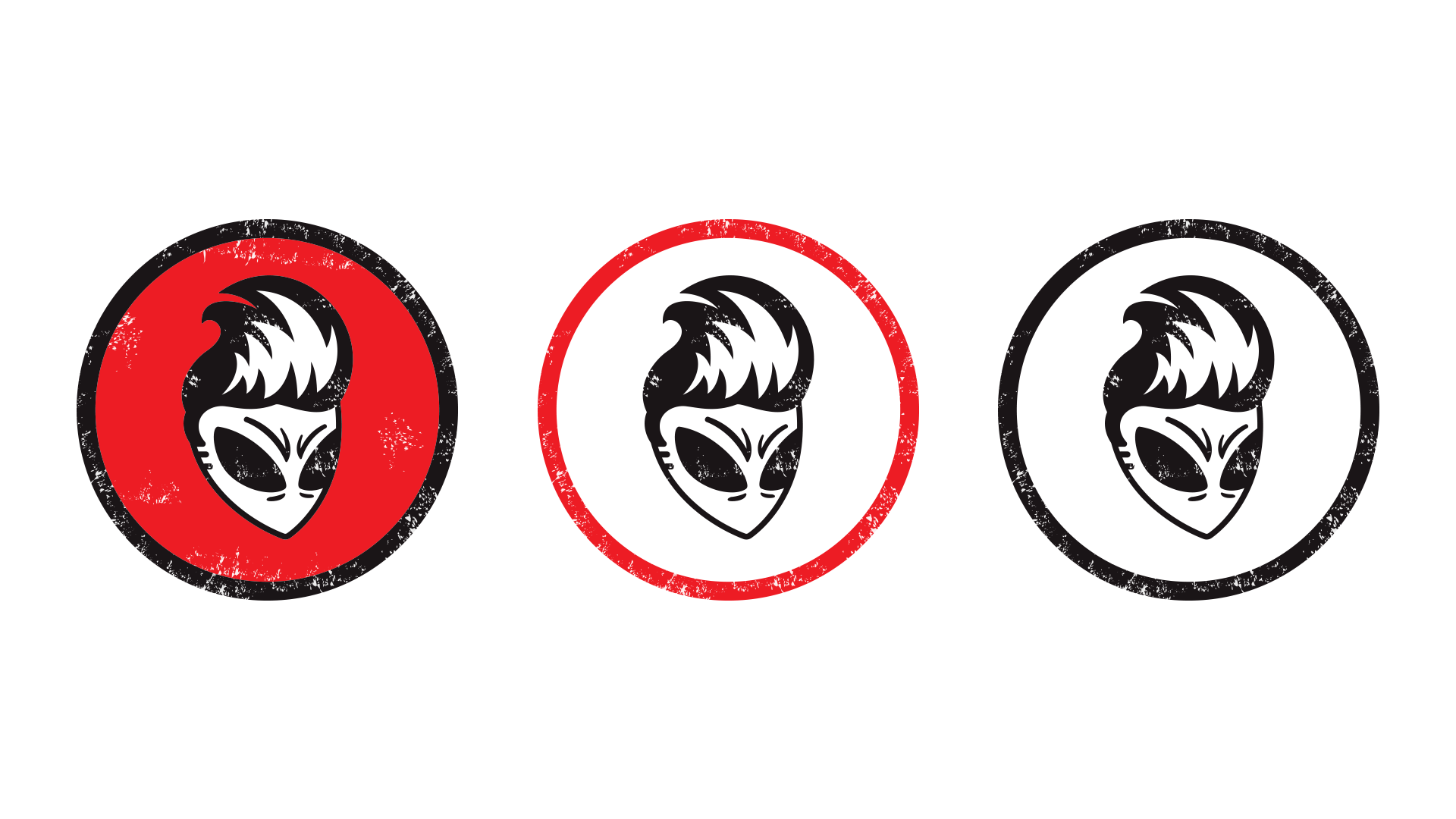
Roswell Rehearsals Mascot
- Illustration
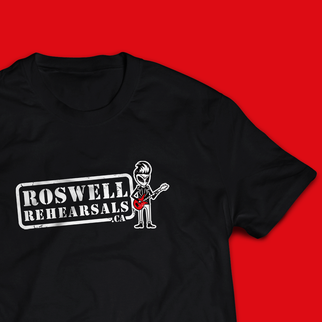
Roswell Rehearsals was a fixture in the Kingston music community for years, providing an affordable space for musicians to gather and practice.
They had a simple stamp logo, but their alien-themed identity needed a mascot. Through much development, we crafted “Buck” – a bass playing, leather jacket-wearing alien with a pompadour. We wanted him to be relatable to various genres of music; a lovable, edgy character that perfectly compliments their merch. Buck became synonymous with Roswell Rehearsals, and musicians all over Kingston wear Roswell t-shirts and sport Roswell stickers on their guitar cases that feature Buck’s design.
Buck was developed with various applications in mind, so we created many different lockups and colour variations with him.
Project Credits
- Illustration/Mascot Design by Shape
Ready to Get Started?
We’d love to hear about you and your ideas.
Services
Branding
Your business is unique and your brand should reflect that. We’ll work with you to discover your voice and position in your industry, and create a visual brand that tells your story. Our motion graphics and web design services round out the package, ensuring that your brand presence is consistent and strong across all platforms and in any application.
Timeline: 6–8 weeks
Logo Design
If you’re looking to get things started and aren’t ready for a full brand package, a simple logo design might be right for you.
Timeline: 2–3 weeks

Motion Design
Custom motion design is one of our key offerings. Motion graphics and character animation are incredibly powerful tools for use in telling your story and communicating even complex concepts to your audience. We offer longer animated videos like ads and explanatory videos, as well as shorter animated pieces such as an animated logo to compliment your brand. All of our motion projects follow a step-by-step process that keeps you in the loop.
Timeline varies by project

Illustration
We produce illustrations in a range of styles for many different applications including editorial, packaging, web, motion graphics, and product design. Our reliable process ensures that the result will suit the need of the project.
Timeline varies by project
Misc. Graphic Design
If you’re in need of business cards, brochures, flyers, social media graphics, editorial layouts, digital ads, or anything else, then we’ve got you covered. We can design to work within brand guidelines or come up with a bespoke design to suit the needs of the project.
Timeline varies by project

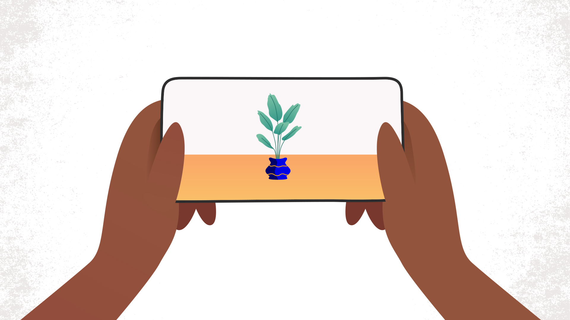
Web Design
+ Web Development
These days, a website is essential for visibility and growth. Our websites are 100% custom, making them stand out amongst the web-builders and template options. All of our websites include basic SEO, and we also offer a hosting solution that includes regular site maintenance.
3–8 weeks
Ready to Get Started?
We’d love to hear about you and your ideas.
Team

Vince
Print Designer

Tara
Motion Designer
Joe
Web Designer